Material Components (MDC) help developers implement Material Design. Created by a team of engineers and UX designers at Google, MDC features dozens of beautiful and functional UI components and is available for Android, iOS, web and Flutter. material.io/develop |

You can now use MDC to customize your apps' unique style more than ever. Material Design's recent expansion gives designers and developers increased flexibility to express their product's brand.
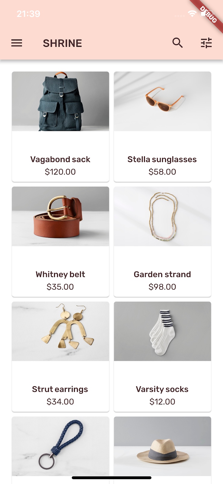
In codelabs MDC-101 and MDC-102, you used Material Components (MDC) to build the basics of an app called Shrine, an e-commerce app that sells clothing and home goods. This app contains a user flow that starts with a login screen, then takes the user to a home screen that displays products.
What you'll build
In this codelab, you'll customize the Shrine app using:
- Color
- Typography
- Elevation
- Shape
- Layout
This is the third of four codelabs that will guide you through building Shrine. The related codelabs can be found at: | By the end of MDC 104, you'll build an app that looks like this:
|
MDC-Flutter components and subsystems in this codelab
- Themes
- Typography
- Elevation
- Image list
What you'll need
- The Flutter SDK
- Android Studio with Flutter plugins, or your favorite code editor
- The sample code
To build and run Flutter apps on iOS:
- A computer running macOS
- Xcode 9 or newer
- iOS Simulator, or a physical iOS device
To build and run Flutter apps on Android:
- A computer running macOS, Windows, or Linux
- Android Studio
- Android Emulator (comes with Android Studio), or a physical Android device
How would you rate your level of experience with Flutter development?
You need two pieces of software to complete this lab: the Flutter SDK, and an editor. This codelab assumes Android Studio, but you can use your preferred editor.
You can run this codelab using any of the following devices:
- A physical device (Android or iOS) connected to your computer and set to developer mode.
- The iOS simulator. (Requires installing XCode tools.)
- The Android emulator. (Requires setup in Android Studio.)
Continuing from MDC-102?
If you completed MDC-102, your code should be ready to go for this codelab. Skip to step: Change the colors.
Starting from scratch?
Download the starter codelab app
The starter app is located in the material-components-flutter-codelabs-103-starter_and_102-complete/mdc_100_series directory.
...or clone it from GitHub
To clone this codelab from GitHub, run the following commands:
git clone https://github.com/material-components/material-components-flutter-codelabs.git
cd material-components-flutter-codelabs
git checkout 103-starter_and_102-complete
Set up your project
The following instructions assume you're using Android Studio (IntelliJ).
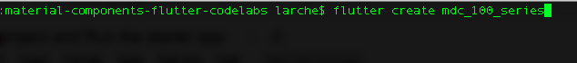
Create the project
1. In Terminal, navigate to | |
2. Run |
Open the project
1. Open Android Studio. | |
2. If you see the welcome screen, click Open an existing Android Studio project. | |
3. Navigate to the You can ignore any errors you see in analysis until you've built the project once. | |
4. In the project panel on the left, delete the testing file | |
5. If prompted, install any platform and plugin updates or FlutterRunConfigurationType, then restart Android Studio. |


Run the starter app
The following instructions assume you're testing on an Android emulator or device but you can also test on an iOS Simulator or device if you have Xcode installed.
1. Select the device or emulator. If the Android emulator is not already running, select Tools -> Android -> AVD Manager to create a virtual device and start the emulator. If an AVD already exists, you can start the emulator directly from the device selector in IntelliJ, as shown in the next step. (For the iOS Simulator, if it is not already running, launch the simulator on your development machine by selecting Flutter Device Selection -> Open iOS Simulator.) | |
2. Start your Flutter app:
|

 ).
).
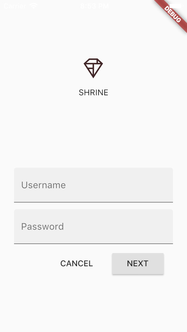
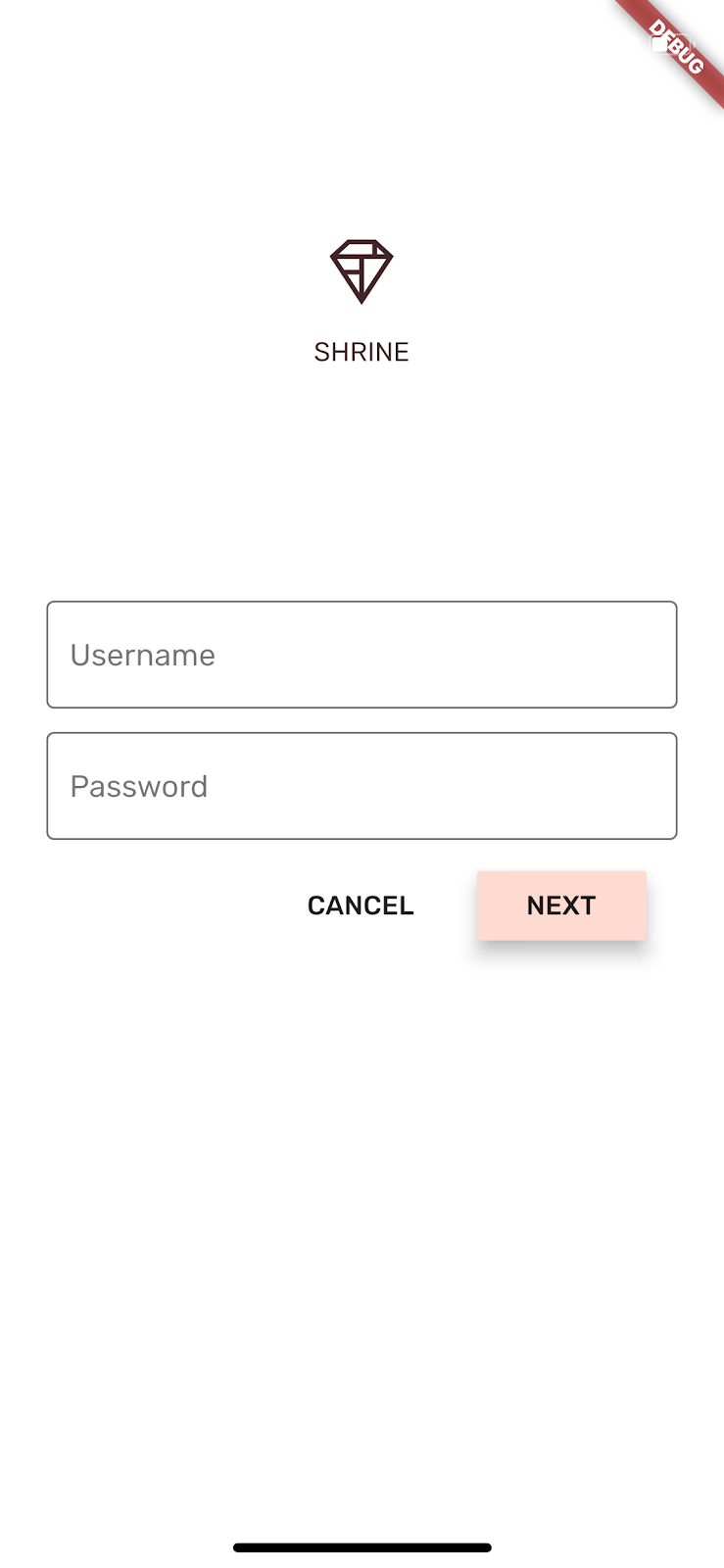
Success! You should see the Shrine login page from the previous codelabs in the simulator or emulator.
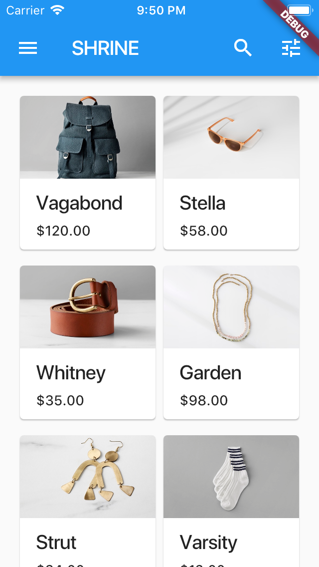
Click "Next" to see the home page from the previous codelab.
A color scheme has been created that represents the Shrine brand, and the designer would like to you implement that color scheme across the Shrine app
To start, let's import those colors into our project.
Create colors.dart
Create a new dart file in lib called colors.dart. Import Material Components and add const Color values:
import 'package:flutter/material.dart';
const kShrinePink50 = const Color(0xFFFEEAE6);
const kShrinePink100 = const Color(0xFFFEDBD0);
const kShrinePink300 = const Color(0xFFFBB8AC);
const kShrinePink400 = const Color(0xFFEAA4A4);
const kShrineBrown900 = const Color(0xFF442B2D);
const kShrineErrorRed = const Color(0xFFC5032B);
const kShrineSurfaceWhite = const Color(0xFFFFFBFA);
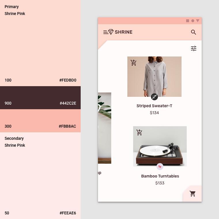
const kShrineBackgroundWhite = Colors.white;Custom color palette
This color theme has been created by a designer with custom colors (shown in the image below). It contains colors that have been selected from Shrine's brand and applied to the Material Theme Editor, which has expanded them to create a fuller palette. (These colors aren't from the 2014 Material color palettes.)
The Material Theme Editor has organized them into shades labelled numerically, including labels 50, 100, 200, .... to 900 of each color. Shrine only uses shades 50, 100, and 300 from the pink swatch and 900 from the brown swatch.

Each colored parameter of a widget is mapped to a color from these schemes. For example, the color for a text field's decorations when it's actively receiving input should be the theme's Primary color. If that color isn't accessible (easy to see against its background), use the PrimaryVariant instead.
Each colored parameter of a widget is mapped to a color from these schemes. For example, the color for a text field's decorations when it's actively receiving input should be the theme's Primary color. If that color isn't accessible (easy to see against its background), use the PrimaryVariant instead.
Now that we have the colors we want to use, we can apply them to the UI. We'll do this by setting the values of a ThemeData widget that we apply to the MaterialApp instance at the top of our widget hierarchy.
Customize ThemeData.light()
Flutter includes a few built-in themes. The light theme is one of them. Rather than making a ThemeData widget from scratch, we'll copy the light theme and change the values to customize them for our app.
Let's import colors.dart.
import 'colors.dart';Then add the following to app.dart outside the scope of the ShrineApp class:
// TODO: Build a Shrine Theme (103)
final ThemeData _kShrineTheme = _buildShrineTheme();

ThemeData _buildShrineTheme() {
  final ThemeData base = ThemeData.light();
  return base.copyWith(
    accentColor: kShrineBrown900,
    primaryColor: kShrinePink100,
    buttonColor: kShrinePink100,
    scaffoldBackgroundColor: kShrineBackgroundWhite,
    cardColor: kShrineBackgroundWhite,
    textSelectionColor: kShrinePink100,
    errorColor: kShrineErrorRed,
    // TODO: Add the text themes (103)
    // TODO: Add the icon themes (103)
    // TODO: Decorate the inputs (103)
  );
}
Now, set the theme: at the end of ShrineApp's build() function (in the MaterialApp widget) to be our new theme:
// TODO: Add a theme (103)
return MaterialApp(
  title: 'Shrine',
  // TODO: Change home: to a Backdrop with a HomePage frontLayer (104)
  home: HomePage(),
  // TODO: Make currentCategory field take _currentCategory (104)
  // TODO: Pass _currentCategory for frontLayer (104)
  // TODO: Change backLayer field value to CategoryMenuPage (104)
  initialRoute: '/login',
  onGenerateRoute: _getRoute,
  theme: _kShrineTheme, // New code
);
Click the Play button. Your login screen should now look like this:
And your home screen should look like this:
In addition to color changes, the designer has also given us specific typography to use. Flutter's ThemeData includes 3 text themes. Each text theme is a collection of text styles, like "headline" and "title". We'll use a couple of styles for our app and change some of the values.
Customize the text theme
In order to import fonts into the project, they have to be added to the pubspec.yaml file.
In pubspec.yaml, add the following immediately after the flutter: tag:
  # TODO: Insert Fonts (103)
  fonts:
    - family: Rubik
      fonts:
        - asset: fonts/Rubik-Regular.ttf
        - asset: fonts/Rubik-Medium.ttf
          weight: 500
Now you can access and use the Rubik font.
Troubleshooting the pubspec file
You may get errors in running pub get if you cut and paste the declaration above. If you get errors, start by removing the leading whitespace and replacing it with spaces using 2-space indentation. (Two spaces before
fonts:, four spaces before
family: Rubik, and so on.)
If you see Mapping values are not allowed here, check the indentation of the line that has the problem and the indentation of the lines above it.
In app.dart, add the following after _buildShrineTheme():
// TODO: Build a Shrine Text Theme (103)
TextTheme _buildShrineTextTheme(TextTheme base) {
  return base.copyWith(
    headline: base.headline.copyWith(
      fontWeight: FontWeight.w500,
    ),
    title: base.title.copyWith(
        fontSize: 18.0
    ),
    caption: base.caption.copyWith(
      fontWeight: FontWeight.w400,
      fontSize: 14.0,
    ),
  ).apply(
    fontFamily: 'Rubik',
    displayColor: kShrineBrown900,
    bodyColor: kShrineBrown900,
  );
}
This takes a TextTheme and changes how the headlines, titles, and captions look.
Applying the fontFamily in this way applies the changes only to the typography scale values specified in copyWith() (headline, title, caption).
For some fonts, we're setting a custom fontWeight. The FontWeight widget has convenient values on the 100s. In fonts, w500 (the 500 weight) is usually the medium and w400 is usually the regular.
Use the new text themes
Add the following themes to _buildShrineTheme after errorColor:
// TODO: Add the text themes (103)

textTheme: _buildShrineTextTheme(base.textTheme),
primaryTextTheme: _buildShrineTextTheme(base.primaryTextTheme),
accentTextTheme: _buildShrineTextTheme(base.accentTextTheme),
Click the Stop button and then the Play button.
Text in the login and home screens look different—some text uses the Rubik font, and other text renders in brown, instead of black or white.

Notice that the icons are still white. That's because there's a separate theme for icons.
Use a customized primary icon theme
Add it to the _buildShrineTheme() function:
    // TODO: Add the icon theme (103)
    primaryIconTheme: base.iconTheme.copyWith(
      color: kShrineBrown900
    ),
Click the play button.
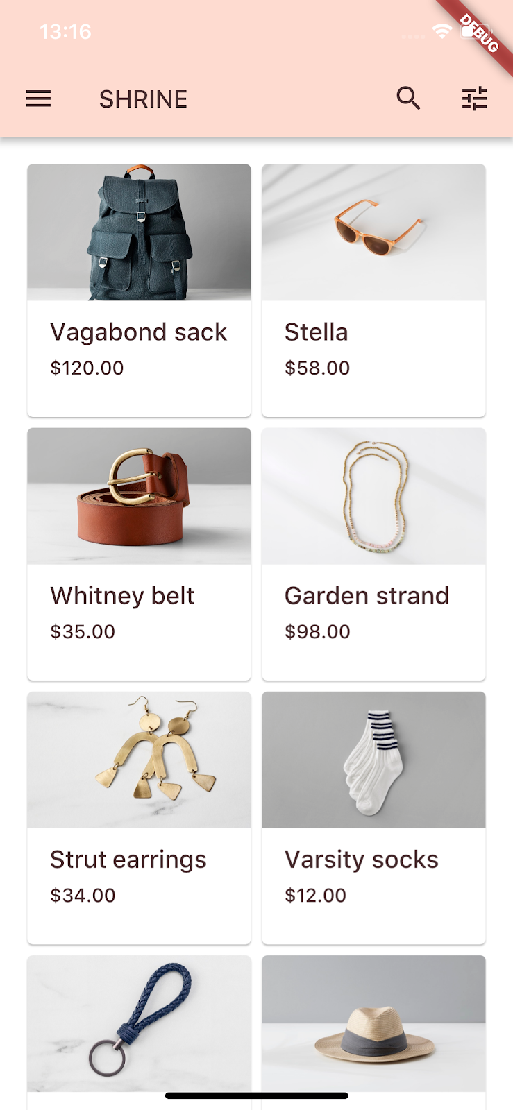
Brown icons in the app bar!
Shrink the text
The labels are just a little too big.
In home.dart, change the children: of the innermost Column:
// TODO: Change innermost Column (103)
children: <Widget>[
// TODO: Handle overflowing labels (103)

  Text(
    product == null ? '' : product.name,
    style: theme.textTheme.button,
    softWrap: false,
    overflow: TextOverflow.ellipsis,
    maxLines: 1,
  ),
  SizedBox(height: 4.0),
  Text(
    product == null ? '' : formatter.format(product.price),
    style: theme.textTheme.caption,
  ),
  // End new code
],
Center and drop the text
We want to center the labels, and align the text to the bottom of each card, instead of the bottom of each image.
Move the labels to the end (bottom) of the main axis and change them to be centered::
// TODO: Align labels to the bottom and center (103)

  mainAxisAlignment: MainAxisAlignment.end,
  crossAxisAlignment: CrossAxisAlignment.center,
Save the project.
It's close, but the text isn't centered to the card.
Change the parent Column's cross-axis alignment:
// TODO: Center items on the card (103)

    crossAxisAlignment: CrossAxisAlignment.center,
Save the project. Your home screen should now look like this:
That looks much better.
Theme the text fields
You can also theme the decoration on text fields with an InputDecorationTheme.
In app.dart, in the _buildShrineTheme() method, specify an inputDecorationTheme: value:
// TODO: Decorate the inputs (103)

inputDecorationTheme: InputDecorationTheme(
  border: OutlineInputBorder(),
),
Right now, the text fields have a filled decoration. Let's remove that.
In login.dart, remove the filled: true values:
// Remove filled: true values (103)
TextField(
controller: _usernameController,
decoration: InputDecoration(
// Removed filled: true
labelText: 'Username',
),
),
SizedBox(height: 12.0),
TextField(
controller: _passwordController,
decoration: InputDecoration(
// Removed filled: true
labelText: 'Password',
),
obscureText: true,
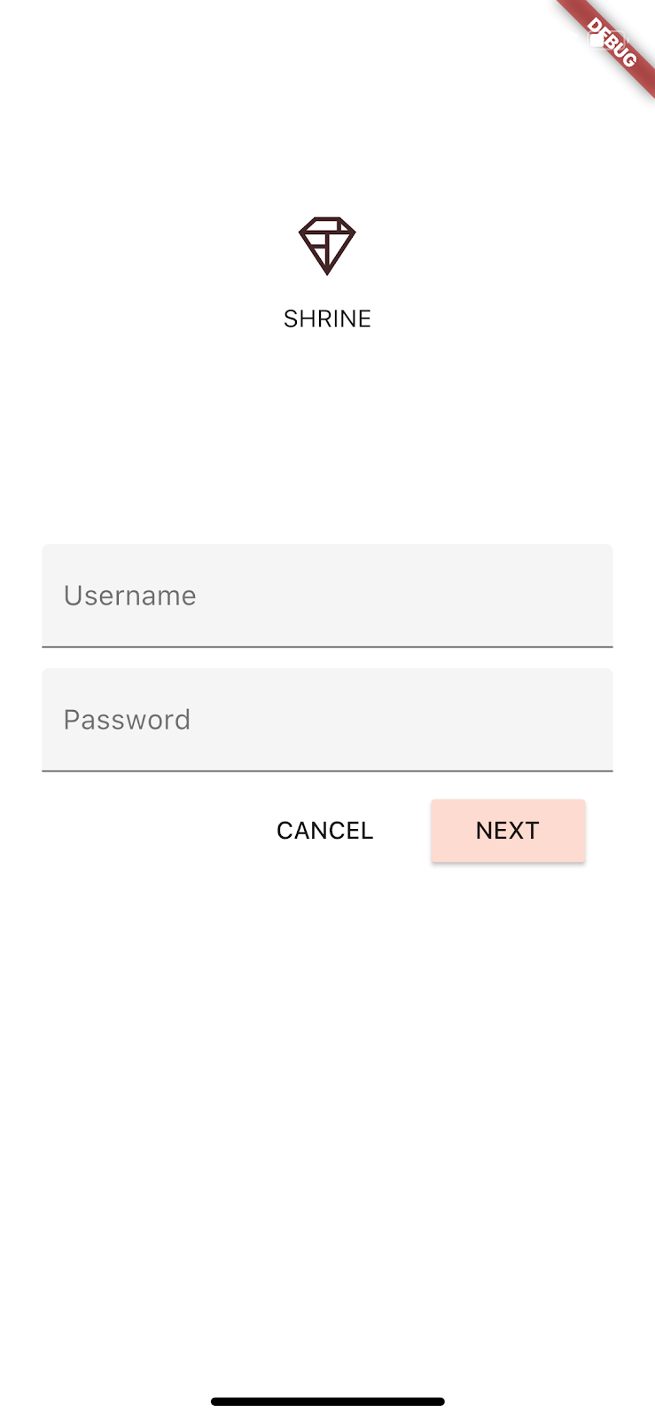
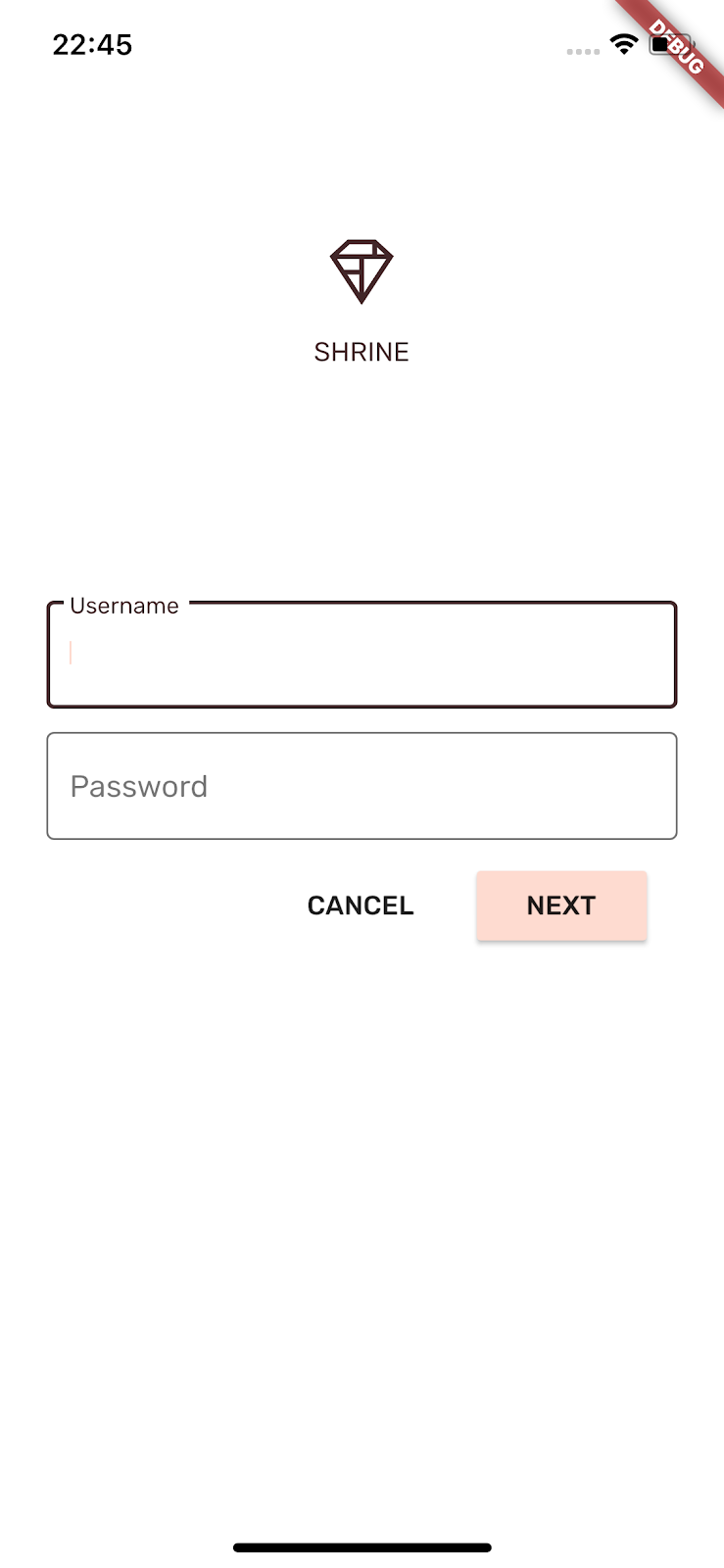
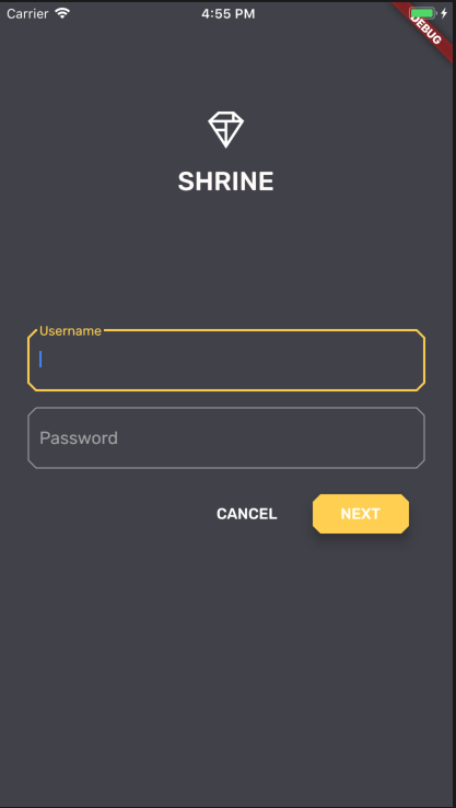
),Click the Stop button, and then Play (to restart the app from the beginning). Your login screen should look like this when the Username field is active (when you're typing in it):
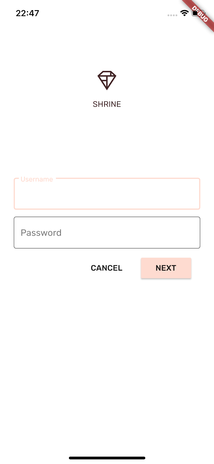
Type into a text field—decorations and floating placeholder renders in the correct Accent color. But we can't see it very easily. It's not accessible to people who have trouble distinguishing pixels that don't have a high enough color contrast. (For more information, see "Accessible colors" in the Material Guidelines Color article.) Let's make a special class to override the Accent color for a widget to be the PrimaryVariant the designer gave us in the color theme above.
In login.dart, add the following outside the scope of any other class:
// TODO: Add AccentColorOverride (103)
class AccentColorOverride extends StatelessWidget {
  const AccentColorOverride({Key key, this.color, this.child})
      : super(key: key);

  final Color color;
  final Widget child;

  @override
  Widget build(BuildContext context) {
    return Theme(
      child: child,
      data: Theme.of(context).copyWith(accentColor: color),
    );
  }
}
Next, you'll apply AccentColorOverride to the text fields.
In login.dart, import the colors:
import 'colors.dart';Wrap the Username text field with the new widget:
// TODO: Wrap Username with AccentColorOverride (103)
// [Name]
AccentColorOverride(
  color: kShrineBrown900,
  child: TextField(
    controller: _usernameController,
    decoration: InputDecoration(
      labelText: 'Username',
    ),
  ),
),
Wrap the Password text field also:
// TODO: Wrap Password with AccentColorOverride (103)
// [Password]
AccentColorOverride(
  color: kShrineBrown900,
  child: TextField(
    controller: _passwordController,
    decoration: InputDecoration(
      labelText: 'Password',
    ),
  ),
),
Click the Play button.
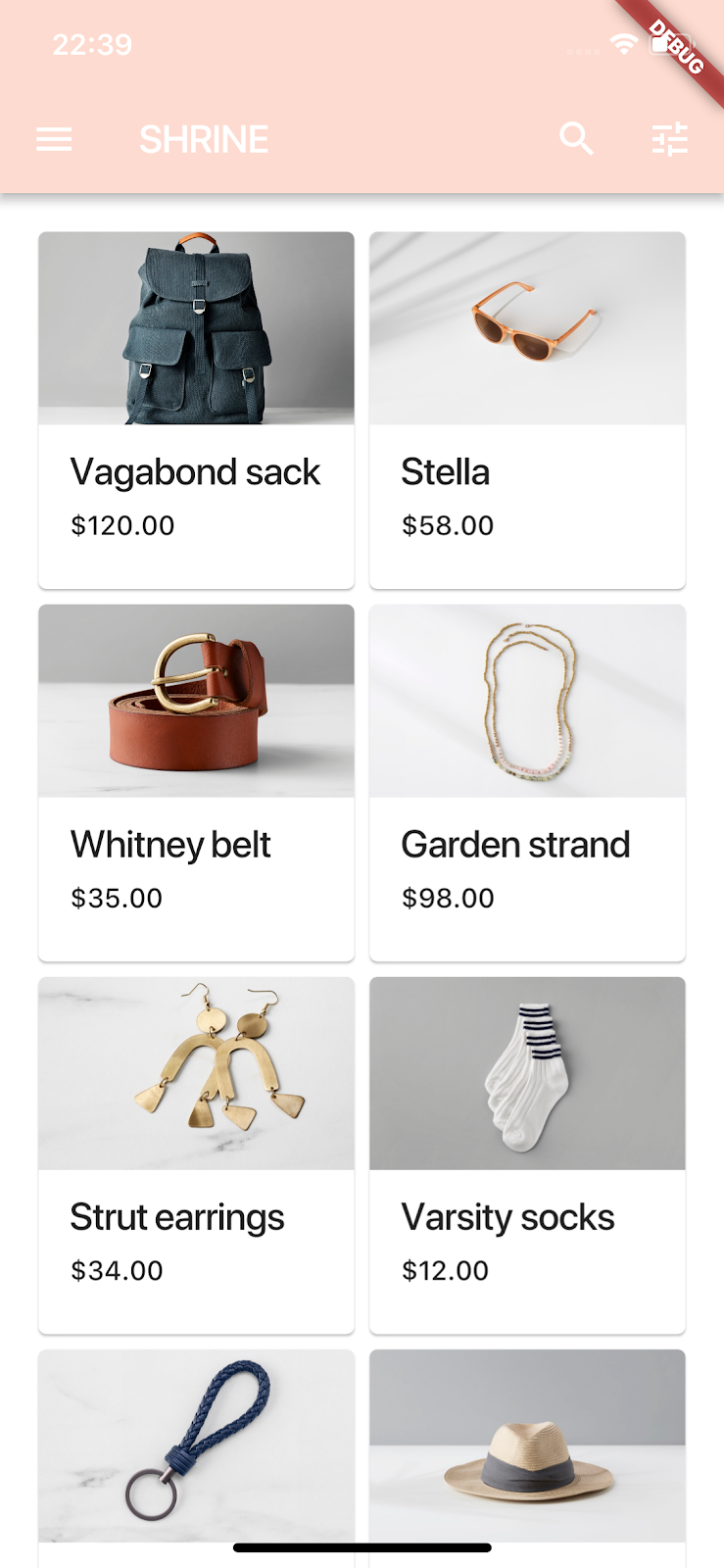
Now that you've styled the page with specific color and typography that matches Shrine, let's take a look at the cards that show Shrine's products. Right now, the cards lay on a white surface next to the site's navigation.
Adjust Card elevation
In home.dart, add an elevation: value to the Cards:
// TODO: Adjust card heights (103)

    elevation: 0.0,
Save the project.

You've removed the shadow under the cards.
Let's change the elevation of the components on the login screen to complement it.
Change the elevation of the NEXT button
The default elevation for RaisedButtons is 2. Let's raise them higher.
In login.dart, add an elevation: value to the NEXT RaisedButton:
RaisedButton(
  child: Text('NEXT'),
  elevation: 8.0, // New code
Click the Stop button, then Play. Your login screen should now look like this:
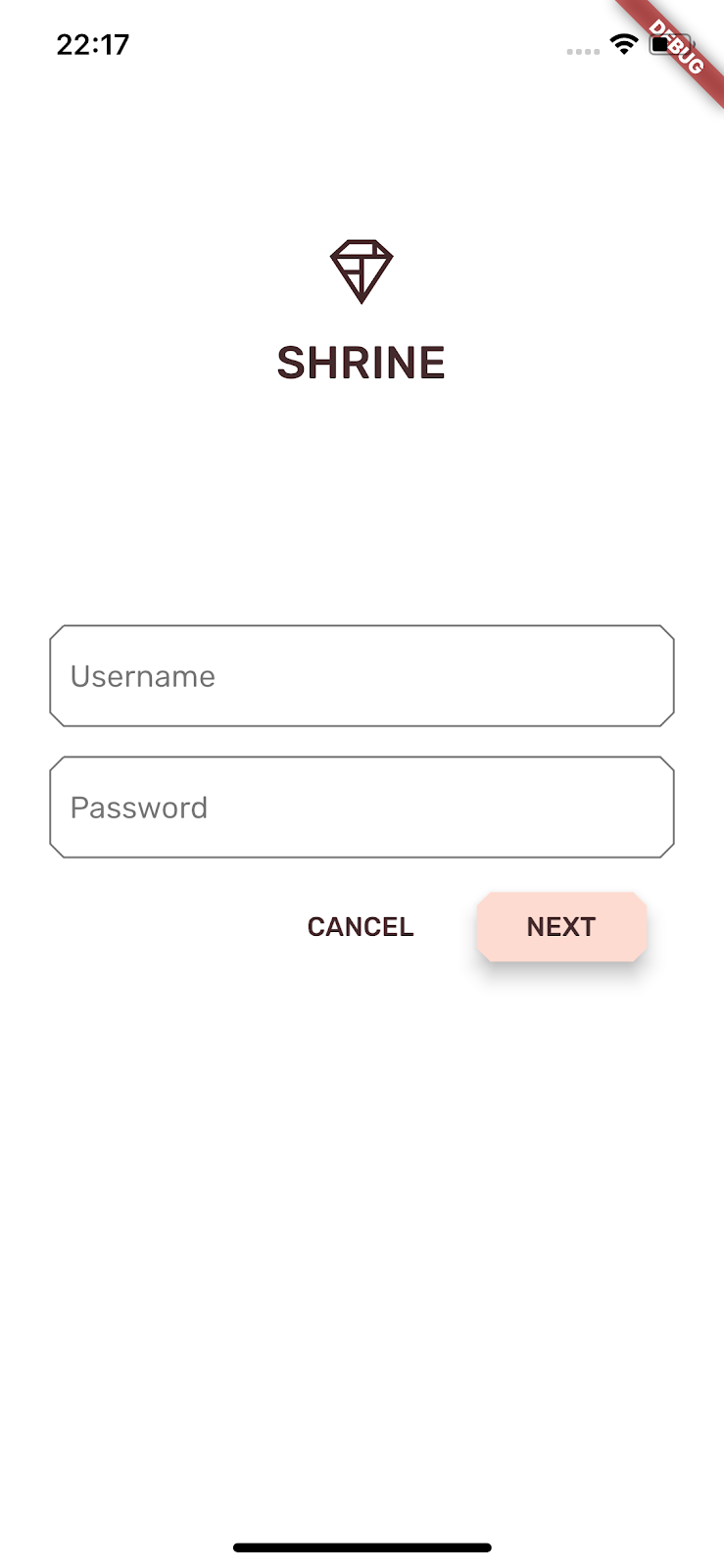
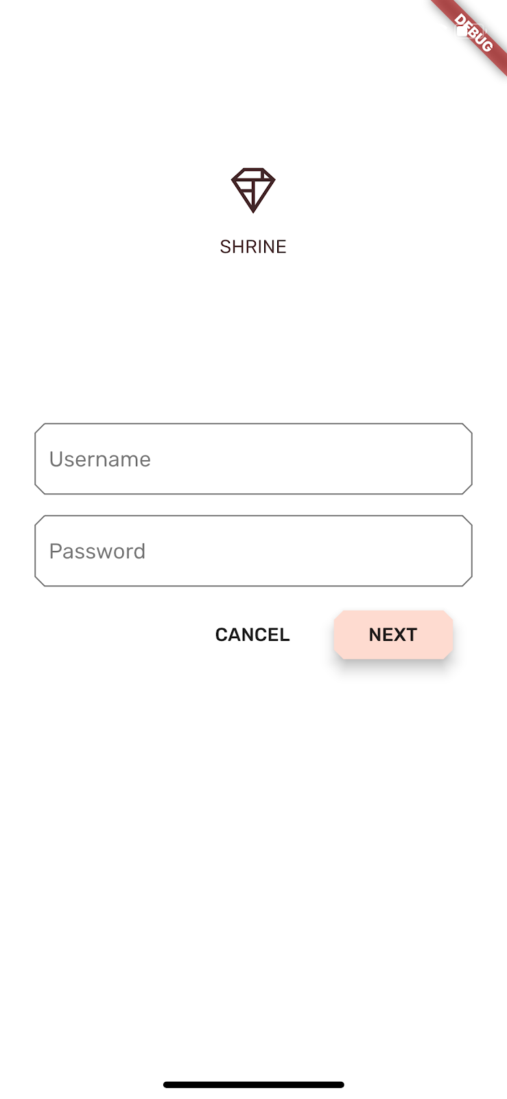
Shrine has a cool geometric style, defining elements with an octagonal or rectangular shape. Let's implement that shape styling in the cards on the home screen, and the text fields and buttons on the login screen.
Change the text field shapes on the login screen
In app.dart, import a special cut corners border file:
import 'supplemental/cut_corners_border.dart';Still in app.dart, add a shape with cut corners to the text field decoration theme:
// TODO: Decorate the inputs (103)
inputDecorationTheme: InputDecorationTheme(
  border: CutCornersBorder(), // Replace code
),
Change button shapes on the login screen
In login.dart, add a beveled rectangular border to the CANCEL button:
FlatButton(
  child: Text('CANCEL'),

  shape: BeveledRectangleBorder(
    borderRadius: BorderRadius.all(Radius.circular(7.0)),
  ),
The FlatButton has no visible shape, so why are we adding a border shape? So the ripple animation is bound to the same shape when touched.
Now add the same shape to the NEXT button:
RaisedButton(
  child: Text('NEXT'),
  elevation: 8.0,
  shape: BeveledRectangleBorder(
    borderRadius: BorderRadius.all(Radius.circular(7.0)),
),Click the Stop button, and then Play:
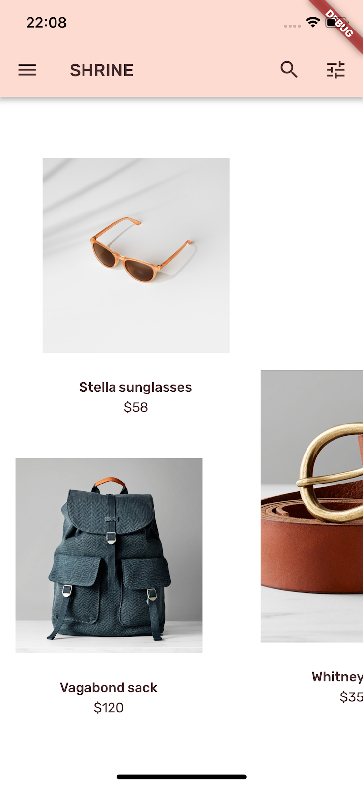
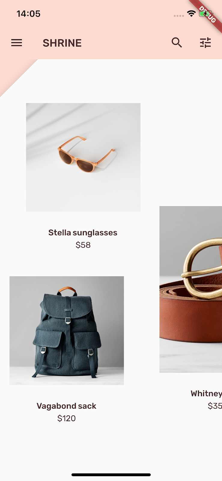
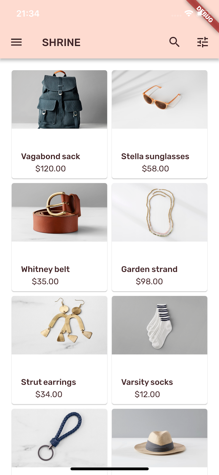
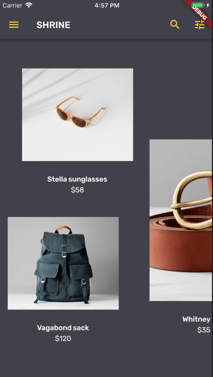
Next, let's change the layout to show the cards at different aspect ratios and sizes, so that each card looks unique from the others.
Replace GridView with AsymmetricView
We've already written the files for an asymmetrical layout.
In home.dart, change the whole file to the following:
import 'package:flutter/material.dart';

import 'model/products_repository.dart';
import 'model/product.dart';
import 'supplemental/asymmetric_view.dart';

class HomePage extends StatelessWidget {
  // TODO: Add a variable for Category (104)

  @override
  Widget build(BuildContext context) {
  // TODO: Return an AsymmetricView (104)
  // TODO: Pass Category variable to AsymmetricView (104)
    return Scaffold(
      appBar: AppBar(
        brightness: Brightness.light,
        leading: IconButton(
          icon: Icon(Icons.menu),
          onPressed: () {
            print('Menu button');
          },
        ),
        title: Text('SHRINE'),
        actions: <Widget>[
          IconButton(
            icon: Icon(Icons.search),
            onPressed: () {
              print('Search button');
            },
          ),
          IconButton(
            icon: Icon(Icons.tune),
            onPressed: () {
              print('Filter button');
            },
          ),
        ],
      ),
      body: AsymmetricView(products: ProductsRepository.loadProducts(Category.all)),
    );
  }
}
Save the project.

Now the products scroll horizontally in a woven-inspired pattern. Also, the status bar text (time and network at the top) is now black. That's because we changed the AppBar's brightness to light, brightness: Brightness.light
Color is a powerful way to express your brand, and a small change in color can have a large effect on your user experience. To test this out, let's see what Shrine looks like if the color scheme of the brand were completely different.
Modify colors
In colors.dart, add the following:
const kShrineAltDarkGrey = const Color(0xFF414149);
const kShrineAltYellow = const Color(0xFFFFCF44);
In app.dart, change the _buildShrineTheme() and _buildShrineTextTheme functions to the following:
ThemeData _buildShrineTheme() {
  final ThemeData base = ThemeData.dark();
  return base.copyWith(
    accentColor: kShrineAltDarkGrey,
    primaryColor: kShrineAltDarkGrey,
    buttonColor: kShrineAltYellow,
    scaffoldBackgroundColor: kShrineAltDarkGrey,
    cardColor: kShrineAltDarkGrey,
    textSelectionColor: kShrinePink100,
    errorColor: kShrineErrorRed,
    textTheme: _buildShrineTextTheme(base.textTheme),
    primaryTextTheme: _buildShrineTextTheme(base.primaryTextTheme),
    accentTextTheme: _buildShrineTextTheme(base.accentTextTheme),
    primaryIconTheme: base.iconTheme.copyWith(
      color: kShrineAltYellow
    ),
    inputDecorationTheme: InputDecorationTheme(
      border: CutCornersBorder(),
    ),
  );
}

TextTheme _buildShrineTextTheme(TextTheme base) {
  return base.copyWith(
    headline: base.headline.copyWith(
      fontWeight: FontWeight.w500,
    ),
    title: base.title.copyWith(
      fontSize: 18.0
    ),
    caption: base.caption.copyWith(
      fontWeight: FontWeight.w400,
      fontSize: 14.0,
    ),
  ).apply(
    fontFamily: 'Rubik',
    displayColor: kShrineSurfaceWhite,
    bodyColor: kShrineSurfaceWhite,
  );
}
In login.dart, color the logo diamond white:
Image.asset(
  'assets/diamond.png',
  color: kShrineBackgroundWhite, // New code
),
Still in login.dart, change the accent override to yellow for both text fields:
AccentColorOverride(
  color: kShrineAltYellow, // Changed code
  child: TextField(
    controller: _usernameController,
    decoration: InputDecoration(
      labelText: 'Username',
    ),
  ),
),
SizedBox(height: 12.0),
AccentColorOverride(
  color: kShrineAltYellow, // Changed code
  child: TextField(
    controller: _passwordController,
    decoration: const InputDecoration(
      labelText: 'Password',
    ),
  ),
),
In home.dart, change the brightness to dark:
brightness: Brightness.dark,Save the project. The new theme should now appear.
The result is very different!. Let's revert this color code before moving on to 104.
By now, you've created an app that resembles the design specifications from your designer.
Next steps
You've now used the following MDC components: theme, typography, elevation, and shape. You can explore more components and subsystems in the MDC-Flutter library.
Dig into the files in the supplemental directory to learn how we made the horizontally scrolling, asymmetric layout grid.
What if your planned app design contains elements that don't have components in the MDC library? In MDC-104: Material Design Advanced Components we show how to create custom components using the MDC library to achieve a specific look.