Material Components (MDC) help developers implement Material Design. Created by a team of engineers and UX designers at Google, MDC features dozens of beautiful and functional UI components and is available for Android, iOS, web and Flutter. material.io/develop |

In codelab MDC-103, you customized the color, elevation, typography, and shape of Material Components (MDC) to style your app.
A component in the Material Design system performs a set of predefined tasks and has certain characteristics, like a button. However, a button is more than just a way for a user to perform an action, it's also a visual expression of shape, size, and color that lets the user know that it's interactive, and that something will happen upon touch or click.
The Material Design guidelines describe components from a designer's point of view. They describe a wide range of basic functions available across platforms, as well as the anatomic elements that make up each component. For instance, a backdrop contains a back layer and its content, the front layer and its content, motion rules, and display options. Each of these components can be customized for each app's needs, use cases, and content. These pieces are, for the most part, traditional views, controls, and functions from your platform's SDK.
While the Material Design guidelines name many components, not all of them are good candidates for reusable code and therefore aren't found in MDC. You can create these experiences yourself to achieve a customized style for your app, all using traditional code.
What you'll build
In this codelab, you'll change the UI in the Shrine app to a two-level presentation called a "backdrop". The backdrop includes a menu that lists selectable categories used to filter the products shown in the asymmetrical grid. In this codelab, you'll use the following Flutter components:
- Shape
- Motion
- Flutter widgets (that you've used in the previous codelabs)
This is the last of 4 codelabs that guide you through building an app for a product called Shrine. We recommend that you do all of the codelabs in order as they progress through tasks step-by-step. The related codelabs can be found at: |
|
MDC-Flutter component in this codelab
- Shape
What you'll need
- The Flutter SDK
- Android Studio with Flutter plugins, or your favorite code editor
- The sample code
To build and run Flutter apps on iOS:
- A computer running macOS
- Xcode 9 or newer
- iOS Simulator, or a physical iOS device
To build and run Flutter apps on Android:
- A computer running macOS, Windows, or Linux
- Android Studio
- Android Emulator (comes with Android Studio), or a physical Android device
How would you rate your level of experience with Flutter development?
You need two pieces of software to complete this lab: the Flutter SDK, and an editor. This codelab assumes Android Studio, but you can use your preferred editor.
You can run this codelab using any of the following devices:
- A physical device (Android or iOS) connected to your computer and set to developer mode.
- The iOS simulator. (Requires installing XCode tools.)
- The Android emulator. (Requires setup in Android Studio.)
Continuing from MDC-103?
If you completed MDC-103, your code should be ready for this codelab. Skip to step: Add the backdrop menu.
Starting from scratch?
The starter app is located in the material-components-flutter-codelabs-104-starter_and_103-complete/mdc_100_series directory.
...or clone it from GitHub
To clone this codelab from GitHub, run the following commands:
git clone https://github.com/material-components/material-components-flutter-codelabs.git
cd material-components-flutter-codelabs
git checkout 104-starter_and_103-complete
Set up your project
The following instructions assume you're using Android Studio (IntelliJ).
Create the project
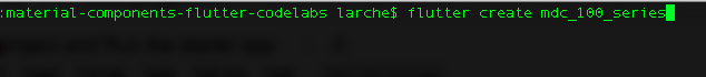
1. In Terminal, navigate to | |
2. Run |
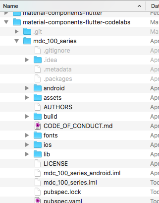
Open the project
1. Open Android Studio. | |
2. If you see the welcome screen, click Open an existing Android Studio project. | |
3. Navigate to the You can ignore any errors you see in analysis until you've built the project once. | |
4. In the project panel on the left, delete the testing file | |
5. If prompted, install any platform and plugin updates or FlutterRunConfigurationType, then restart Android Studio. |


Run the starter app
The following instructions assume you're testing on an Android emulator or device but you can also test on an iOS Simulator or device if you have Xcode installed.
1. Select the device or emulator. If the Android emulator is not already running, select Tools -> Android -> AVD Manager to create a virtual device and start the emulator. If an AVD already exists, you can start the emulator directly from the device selector in IntelliJ, as shown in the next step. (For the iOS Simulator, if it is not already running, launch the simulator on your development machine by selecting Flutter Device Selection -> Open iOS Simulator.) | |
2. Start your Flutter app:
|

 ).
).
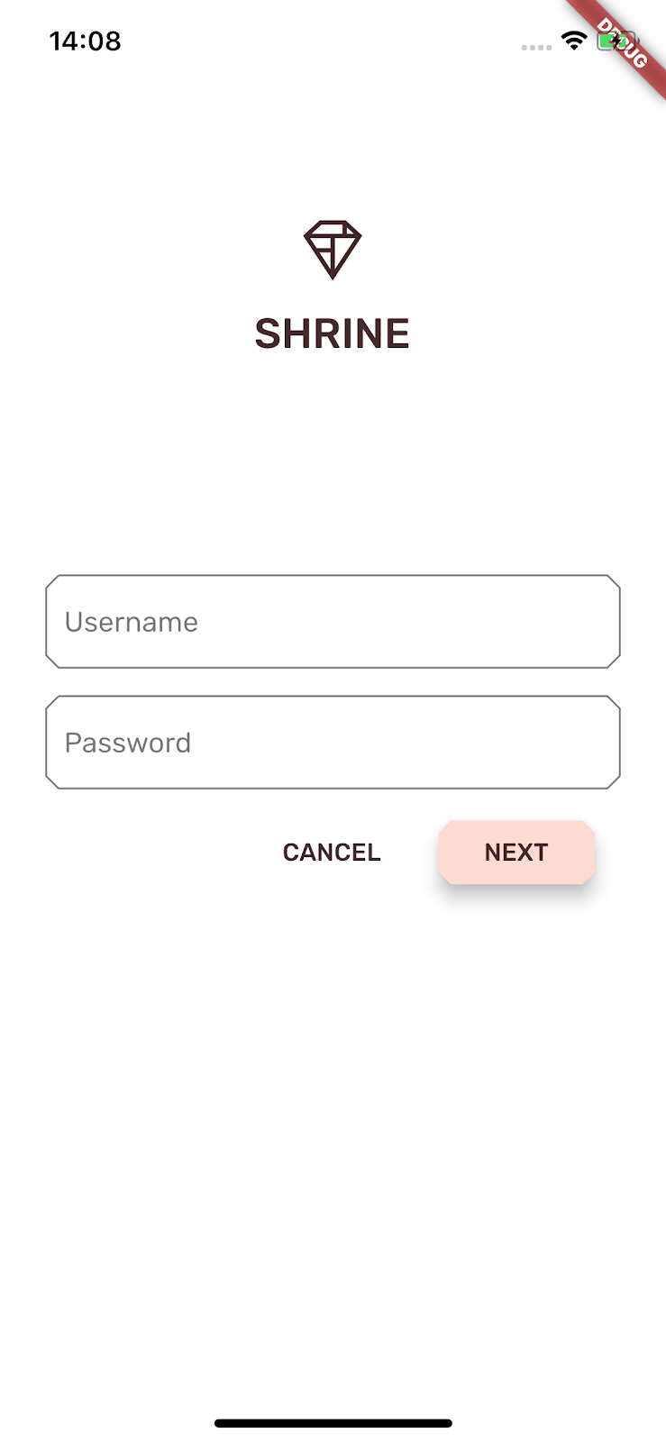
Success! You should see the Shrine login page from the previous codelabs in the simulator or emulator.
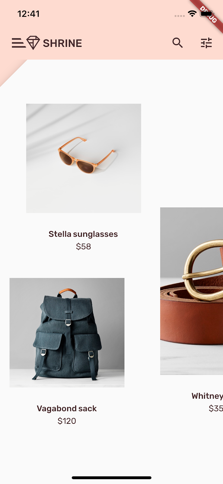
A backdrop appears behind all other content and components. It's composed of two layers: a back layer (that displays actions and filters) and a front layer (that displays content). You can use a backdrop to display interactive information and actions, such as navigation or content filters.
Remove the home app bar
The HomePage widget will be the content of our front layer. Right now it has an app bar. We'll move the app bar to the back layer and the HomePage will only include the AsymmetricView.
In home.dart, change the build() function to just return an AsymmetricView:
// TODO: Return an AsymmetricView (104)
return  AsymmetricView(products: ProductsRepository.loadProducts(Category.all));
Add the Backdrop widget
Create a widget called Backdrop that includes the frontLayer and the backLayer.
The backLayer includes a menu that allows you to select a category to filter the list (currentCategory). Since we want the menu selection to persist, we'll make Backdrop a stateful widget.
Add a new file to /lib named backdrop.dart:
import 'package:flutter/material.dart';
import 'package:meta/meta.dart';

import 'model/product.dart';

// TODO: Add velocity constant (104)

class Backdrop extends StatefulWidget {
  final Category currentCategory;
  final Widget frontLayer;
  final Widget backLayer;
  final Widget frontTitle;
  final Widget backTitle;

  const Backdrop({
    @required this.currentCategory,
    @required this.frontLayer,
    @required this.backLayer,
    @required this.frontTitle,
    @required this.backTitle,
  })  : assert(currentCategory != null),
        assert(frontLayer != null),
        assert(backLayer != null),
        assert(frontTitle != null),
        assert(backTitle != null);

  @override
  _BackdropState createState() => _BackdropState();
}

// TODO: Add _FrontLayer class (104)
// TODO: Add _BackdropTitle class (104)
// TODO: Add _BackdropState class (104)
Import the meta package to mark the properties @required. This is a best practice when you have properties in the constructor that have no default value and cannot be null and therefore should not be forgotten. Notice that we also have asserts after the constructor that check the values passed into those fields are indeed not null.
Under the Backdrop class definition, add _BackdropState class:
// TODO: Add _BackdropState class (104)
class _BackdropState extends State<Backdrop>
    with SingleTickerProviderStateMixin {
  final GlobalKey _backdropKey = GlobalKey(debugLabel: 'Backdrop');

  // TODO: Add AnimationController widget (104)

  // TODO: Add BuildContext and BoxConstraints parameters to _buildStack (104)
  Widget _buildStack() {
    return Stack(
    key: _backdropKey,
      children: <Widget>[
        widget.backLayer,
        widget.frontLayer,
      ],
    );
  }

  @override
  Widget build(BuildContext context) {
    var appBar = AppBar(
      brightness: Brightness.light,
      elevation: 0.0,
      // TODO: Replace leading menu icon with IconButton (104)
      // TODO: Remove leading property (104)
      // TODO: Create title with _BackdropTitle parameter (104)
      leading: Icon(Icons.menu),
      title: Text('SHRINE'),
      actions: <Widget>[
        // TODO: Add shortcut to login screen from trailing icons (104)
        IconButton(
          icon: Icon(
            Icons.search,
            semanticLabel: 'search',
          ),
          onPressed: () {
          // TODO: Add open login (104)
          },
        ),
        IconButton(
          icon: Icon(
            Icons.tune,
            semanticLabel: 'filter',
          ),
          onPressed: () {
          // TODO: Add open login (104)
          },
        ),
      ],
    );
    return Scaffold(
      appBar: appBar,
      // TODO: Return a LayoutBuilder widget (104)
      body: _buildStack(),
    );
  }
}
The build() function returns a Scaffold with an app bar just like HomePage used to. But the body of the Scaffold is a Stack. A Stack's children can overlap. Each child's size and location is specified relative to the Stack's parent.
Now add a Backdrop instance to ShrineApp.
In app.dart, import backdrop.dart and model/product.dart:
import 'backdrop.dart'; // New code
import 'colors.dart';
import 'home.dart';
import 'login.dart';
import 'model/product.dart'; // New code
import 'supplemental/cut_corners_border.dart';
In app.dart, modify the ShrineApp's build() function. Change home: to a Backdrop that has a HomePage as its frontLayer:
      // TODO: Change home: to a Backdrop with a HomePage frontLayer (104)
      home: Backdrop(
        // TODO: Make currentCategory field take _currentCategory (104)
        currentCategory: Category.all,
        // TODO: Pass _currentCategory for frontLayer (104)
        frontLayer: HomePage(),
        // TODO: Change backLayer field value to CategoryMenuPage (104)
        backLayer: Container(color: kShrinePink100),
        frontTitle: Text('SHRINE'),
        backTitle: Text('MENU'),
      ),
If you hit the Play button, you should see that our home page is showing up and so is the app bar:
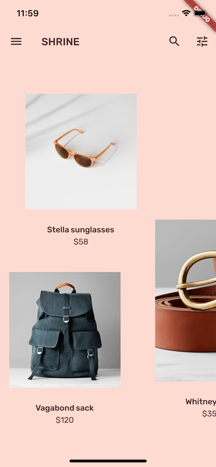
The backLayer shows the pink area in a new layer behind the frontLayer home page.
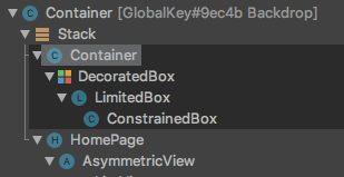
You can use the Flutter Inspector to verify that the Stack indeed has a Container behind a HomePage. It should similar to this:
You can now adjust the design and content of the two layers.
In this step, you'll style the front layer to add a cut in the upper left corner.
Material Design refers to this type of customization as a shape. Material surfaces can have arbitrary shapes. Shapes add emphasis and style to surfaces and can be used to express branding. Ordinary rectangular shapes can be customized with curved or angled corners and edges, and any number of sides. They can be symmetrical or irregular.
Add a shape to the front layer
The angled Shrine logo inspired the shape story for the Shrine app. The shape story is the common use of shapes that are applied throughout an app. For example, the logo shape is echoed in the login page elements that have shape applied to them. In this step, you'll style the front layer with an angled cut in the upper-left corner.
In backdrop.dart, add a new class _FrontLayer:
// TODO: Add _FrontLayer class (104)
class _FrontLayer extends StatelessWidget {
  // TODO: Add on-tap callback (104)
  const _FrontLayer({
    Key key,
    this.child,
  }) : super(key: key);

  final Widget child;

  @override
  Widget build(BuildContext context) {
    return Material(
      elevation: 16.0,
      shape: BeveledRectangleBorder(
        borderRadius: BorderRadius.only(topLeft: Radius.circular(46.0)),
      ),
      child: Column(
        crossAxisAlignment: CrossAxisAlignment.stretch,
        children: <Widget>[
          // TODO: Add a GestureDetector (104)
          Expanded(
            child: child,
          ),
        ],
      ),
    );
  }
}
Then, in _BackdropState's _buildStack() function, wrap the front layer in a _FrontLayer:
  Widget _buildStack() {
    // TODO: Create a RelativeRectTween Animation (104)

    return Stack(
    key: _backdropKey,
      children: <Widget>[
        widget.backLayer,
        // TODO: Add a PositionedTransition (104)
        // TODO: Wrap front layer in _FrontLayer (104)
          _FrontLayer(child: widget.frontLayer),
      ],
    );
  }
Reload.
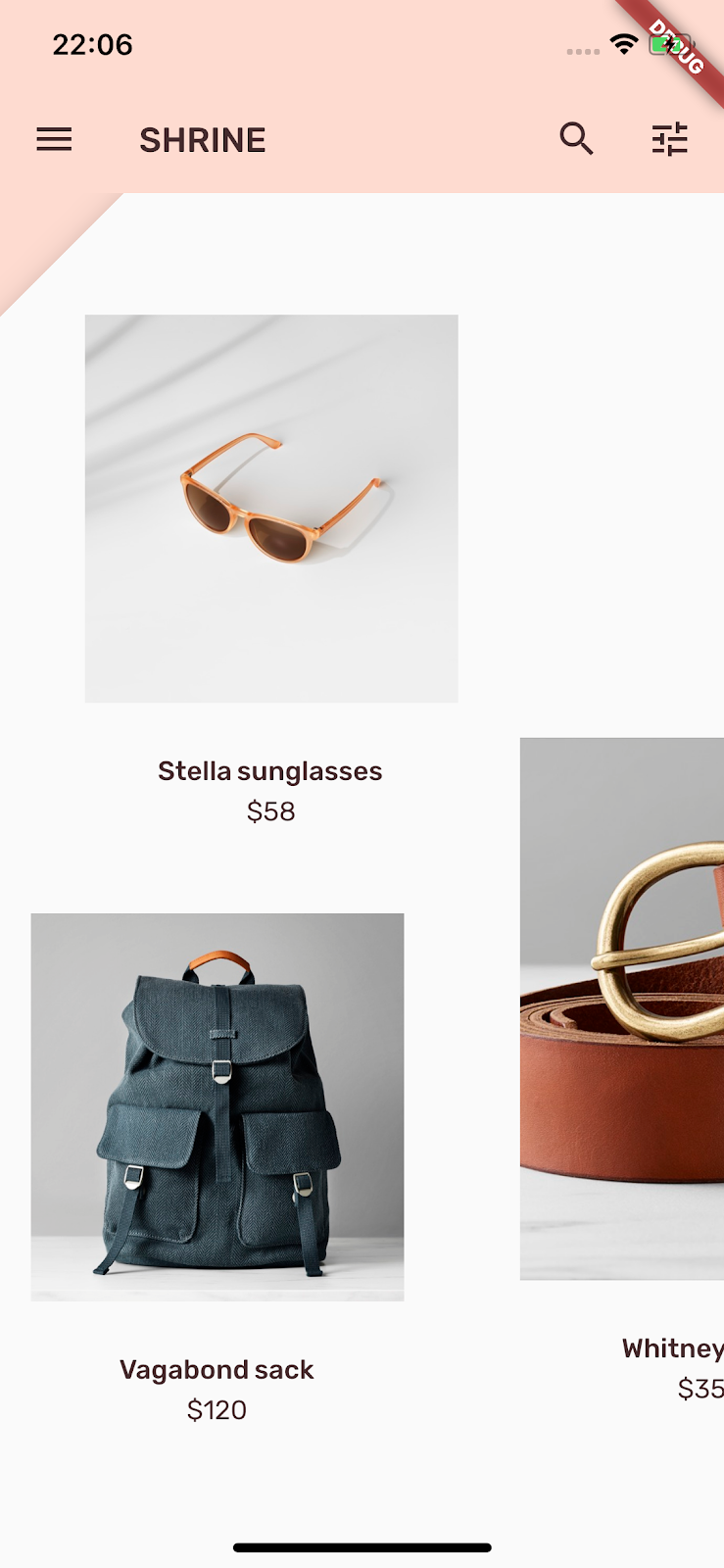
We've given Shrine's primary surface a custom shape. Because of the surface elevation, users can see that there is something just behind the front white layer. Let's add motion so that users can see the backdrop's back layer.
Motion is a way to bring your app to life. It can be big and dramatic, subtle and minimal, or anywhere in between. But keep in mind that the type of motion you use should be suitable to the situation. Motion that's applied to repeated, regular actions should be small and subtle, so that the actions don't distract the user or take up too much time on a regular basis. But there are appropriate situations, like the first time a user opens an app, that can be more eye-catching, and some animations can help educate the user about how to use your app.
Add reveal motion to the menu button
At the top of backdrop.dart, outside the scope of any class of function, add a constant to represent the velocity we want our animation to have:
// TODO: Add velocity constant (104)
const double _kFlingVelocity = 2.0;
Add an AnimationController widget to _BackdropState, instantiate it in the initState() function, and dispose of it in the state's dispose() function:
  // TODO: Add AnimationController widget (104)
  AnimationController _controller;

  @override
  void initState() {
    super.initState();
    _controller = AnimationController(
      duration: Duration(milliseconds: 300),
      value: 1.0,
      vsync: this,
    );
  }

  // TODO: Add override for didUpdateWidget (104)

  @override
  void dispose() {
    _controller.dispose();
    super.dispose();
  }

  // TODO: Add functions to get and change front layer visibility (104)
The AnimationController coordinates Animations and gives you API to play, reverse, and stop the animation. Now we need functions that make it move.
Add functions that determine as well as change the visibility of the front layer:
  // TODO: Add functions to get and change front layer visibility (104)
  bool get _frontLayerVisible {
    final AnimationStatus status = _controller.status;
    return status == AnimationStatus.completed ||
        status == AnimationStatus.forward;
  }

  void _toggleBackdropLayerVisibility() {
    _controller.fling(
        velocity: _frontLayerVisible ? -_kFlingVelocity : _kFlingVelocity);
  }
Wrap the backLayer in an ExcludeSemantics widget. This widget will exclude the backLayer's menu items from the semantics tree when the back layer isn't visible.
    return Stack(
      key: _backdropKey,
      children: <Widget>[
        // TODO: Wrap backLayer in an ExcludeSemantics widget (104)
        ExcludeSemantics(
          child: widget.backLayer,
          excluding: _frontLayerVisible,
        ),
      ...
Change the _buildStack() function to take a BuildContext and BoxConstraints. Also, include a PositionedTransition that takes a RelativeRectTween Animation:
  // TODO: Add BuildContext and BoxConstraints parameters to _buildStack (104)
  Widget _buildStack(BuildContext context, BoxConstraints constraints) {
    const double layerTitleHeight = 48.0;
    final Size layerSize = constraints.biggest;
    final double layerTop = layerSize.height - layerTitleHeight;

    // TODO: Create a RelativeRectTween Animation (104)
    Animation<RelativeRect> layerAnimation = RelativeRectTween(
      begin: RelativeRect.fromLTRB(
          0.0, layerTop, 0.0, layerTop - layerSize.height),
      end: RelativeRect.fromLTRB(0.0, 0.0, 0.0, 0.0),
    ).animate(_controller.view);

    return Stack(
      key: _backdropKey,
      children: <Widget>[
        ExcludeSemantics(
          child: widget.backLayer,
          excluding: _frontLayerVisible,
        ),
        // TODO: Add a PositionedTransition (104)
        PositionedTransition(
          rect: layerAnimation,
          child: _FrontLayer(
            // TODO: Implement onTap property on _BackdropState (104)
            child: widget.frontLayer,
          ),
        ),
      ],
    );
  }
Finally, instead of calling the _buildStack function for the body of the Scaffold, return a LayoutBuilder widget that uses _buildStack as its builder:
    return Scaffold(
      appBar: appBar,
      // TODO: Return a LayoutBuilder widget (104)
      body: LayoutBuilder(builder: _buildStack),
    );
We've delayed the build of the front/back layer stack until layout time using LayoutBuilder so that we can incorporate the backdrop's actual overall height. LayoutBuilder is a special widget whose builder callback provides size constraints.
In the build() function, turn the leading menu icon in the app bar into an IconButton and use it to toggle the visibility of the front layer when the button is tapped.
      // TODO: Replace leading menu icon with IconButton (104)
      leading: IconButton(
        icon: Icon(Icons.menu),
        onPressed: _toggleBackdropLayerVisibility,
      ),
Reload then tap the menu button in the simulator.
The front layer animates (slides) down. But if you look down, there's a red error and an overflow error. This is because the AsymmetricView is squeezed and becomes smaller by this animation, which in turn gives less room to the Columns. Eventually, the Columns can't lay themselves out with the space given and they result in an error. If we replace the Columns with ListViews, the column size should remain as they animate.
Wrap product columns in a ListView
In supplemental/product_columns.dart, replace the Column in OneProductCardColumn with a ListView:
class OneProductCardColumn extends StatelessWidget {
  OneProductCardColumn({this.product});

  final Product product;

  @override
  Widget build(BuildContext context) {
    // TODO: Replace Column with a ListView (104)
    return ListView(
      reverse: true,
      children: <Widget>[
        SizedBox(
          height: 40.0,
        ),
        ProductCard(
          product: product,
        ),
      ],
    );
  }
}
The Column includes MainAxisAlignment.end. To begin the layout from the bottom, mark reverse: true. The order of the children is reversed to compensate for the change.
Reload and then tap the menu button.
The gray overflow warning on OneProductCardColumn is gone! Now let's fix the other.
In supplemental/product_columns.dart, change the way the imageAspectRatio is calculated, and replace the Column in TwoProductCardColumn with a ListView:
      // TODO: Change imageAspectRatio calculation (104)
      double imageAspectRatio =
          (heightOfImages >= 0.0 && constraints.biggest.width > heightOfImages)
              ? constraints.biggest.width / heightOfImages
              : 33 / 49;

      // TODO: Replace Column with a ListView (104)
      return ListView(
        children: <Widget>[
          Padding(
            padding: EdgeInsetsDirectional.only(start: 28.0),
            child: top != null
                ? ProductCard(
                    imageAspectRatio: imageAspectRatio,
                    product: top,
                  )
                : SizedBox(
                    height: heightOfCards,
                  ),
          ),
          SizedBox(height: spacerHeight),
          Padding(
            padding: EdgeInsetsDirectional.only(end: 28.0),
            child: ProductCard(
              imageAspectRatio: imageAspectRatio,
              product: bottom,
            ),
          ),
        ],
      );
    });
We also added some safety to imageAspectRatio.
Reload. Then tap the menu button.
No more overflows.
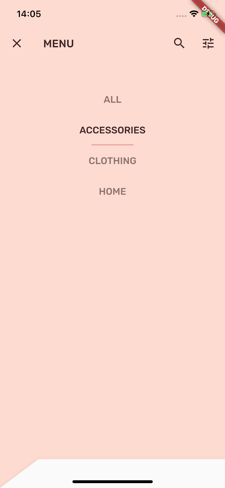
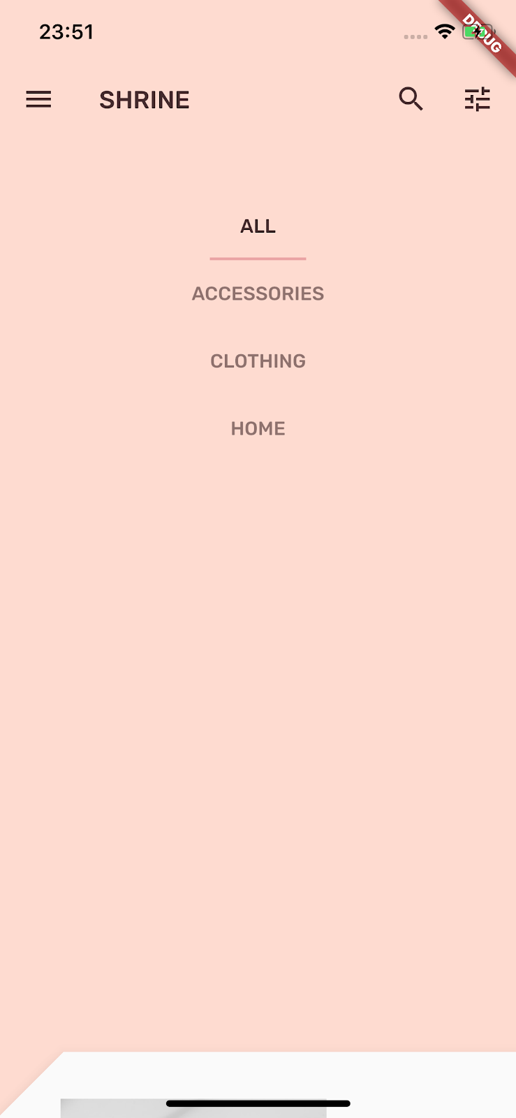
A menu is a list of tappable text items that notify listeners when the text items are touched. In this step, you'll add a category filtering menu.
Add the menu
Add the menu to the front layer and the interactive buttons to the back layer.
Create a new file called lib/category_menu_page.dart:
import 'package:flutter/material.dart';
import 'package:meta/meta.dart';

import 'colors.dart';
import 'model/product.dart';

class CategoryMenuPage extends StatelessWidget {
  final Category currentCategory;
  final ValueChanged<Category> onCategoryTap;
  final List<Category> _categories = Category.values;

  const CategoryMenuPage({
    Key key,
    @required this.currentCategory,
    @required this.onCategoryTap,
  })  : assert(currentCategory != null),
        assert(onCategoryTap != null);

  Widget _buildCategory(Category category, BuildContext context) {
    final categoryString =
        category.toString().replaceAll('Category.', '').toUpperCase();
    final ThemeData theme = Theme.of(context);

    return GestureDetector(
      onTap: () => onCategoryTap(category),
      child: category == currentCategory
        ? Column(
          children: <Widget>[
            SizedBox(height: 16.0),
            Text(
              categoryString,
              style: theme.textTheme.body2,
              textAlign: TextAlign.center,
            ),
            SizedBox(height: 14.0),
            Container(
              width: 70.0,
              height: 2.0,
              color: kShrinePink400,
            ),
          ],
        )
      : Padding(
        padding: EdgeInsets.symmetric(vertical: 16.0),
        child: Text(
          categoryString,
          style: theme.textTheme.body2.copyWith(
              color: kShrineBrown900.withAlpha(153)
            ),
          textAlign: TextAlign.center,
        ),
      ),
    );
  }

  @override
  Widget build(BuildContext context) {
    return Center(
      child: Container(
        padding: EdgeInsets.only(top: 40.0),
        color: kShrinePink100,
        child: ListView(
          children: _categories
            .map((Category c) => _buildCategory(c, context))
            .toList()),
      ),
    );
  }
}
It's a GestureDetector wrapping a Column whose children are the category names. An underline is used to indicate the selected category.
In app.dart, convert the ShrineApp widget from stateless to stateful.
- Highlight
ShrineApp. - Press alt (option) + enter.
- Select "Convert to StatefulWidget".
- Change the ShrineAppState class to private (_ShrineAppState). To do this from the IDE main menu, select Refactor > Rename. Alternatively, from within the code, you can highlight the class name, ShrineAppState, then right-click and select Refactor > Rename. Enter _ShrineAppState to make the class private.
In app.dart, add a variable to _ShrineAppState for the selected Category and a callback when it's tapped:
// TODO: Convert ShrineApp to stateful widget (104)
class _ShrineAppState extends State<ShrineApp> {
  Category _currentCategory = Category.all;

  void _onCategoryTap(Category category) {
    setState(() {
      _currentCategory = category;
    });
  }
Then change the back layer to a CategoryMenuPage.
In app.dart, import the CategoryMenuPage:
import 'backdrop.dart';
import 'colors.dart';
import 'home.dart';
import 'login.dart';
import 'category_menu_page.dart';
import 'model/product.dart';
import 'supplemental/cut_corners_border.dart';
In the build() function, change the backlayer field to CategoryMenuPage and the currentCategory field to take the instance variable.
      home: Backdrop(
        // TODO: Make currentCategory field take _currentCategory (104)
        currentCategory: _currentCategory,
        // TODO: Pass _currentCategory for frontLayer (104)
        frontLayer: HomePage(),
        // TODO: Change backLayer field value to CategoryMenuPage (104)
        backLayer: CategoryMenuPage(
          currentCategory: _currentCategory,
          onCategoryTap: _onCategoryTap,
        ),
        frontTitle: Text('SHRINE'),
        backTitle: Text('MENU'),
      ),
Reload and then tap the Menu button.
If you tap a menu option, nothing happens...yet. Let's fix that.
In home.dart, add a variable for Category and pass it to the AsymmetricView.
import 'package:flutter/material.dart';

import 'model/products_repository.dart';
import 'model/product.dart';
import 'supplemental/asymmetric_view.dart';

class HomePage extends StatelessWidget {
  // TODO: Add a variable for Category (104)
  final Category category;

  const HomePage({this.category: Category.all});

  @override
  Widget build(BuildContext context) {
    // TODO: Pass Category variable to AsymmetricView (104)
    return AsymmetricView(products: ProductsRepository.loadProducts(category));
  }
}
In app.dart, pass the _currentCategory for frontLayer:.
        // TODO: Pass _currentCategory for frontLayer (104)
        frontLayer: HomePage(category: _currentCategory),
Reload. Tap the menu button in the simulator and select a Category.
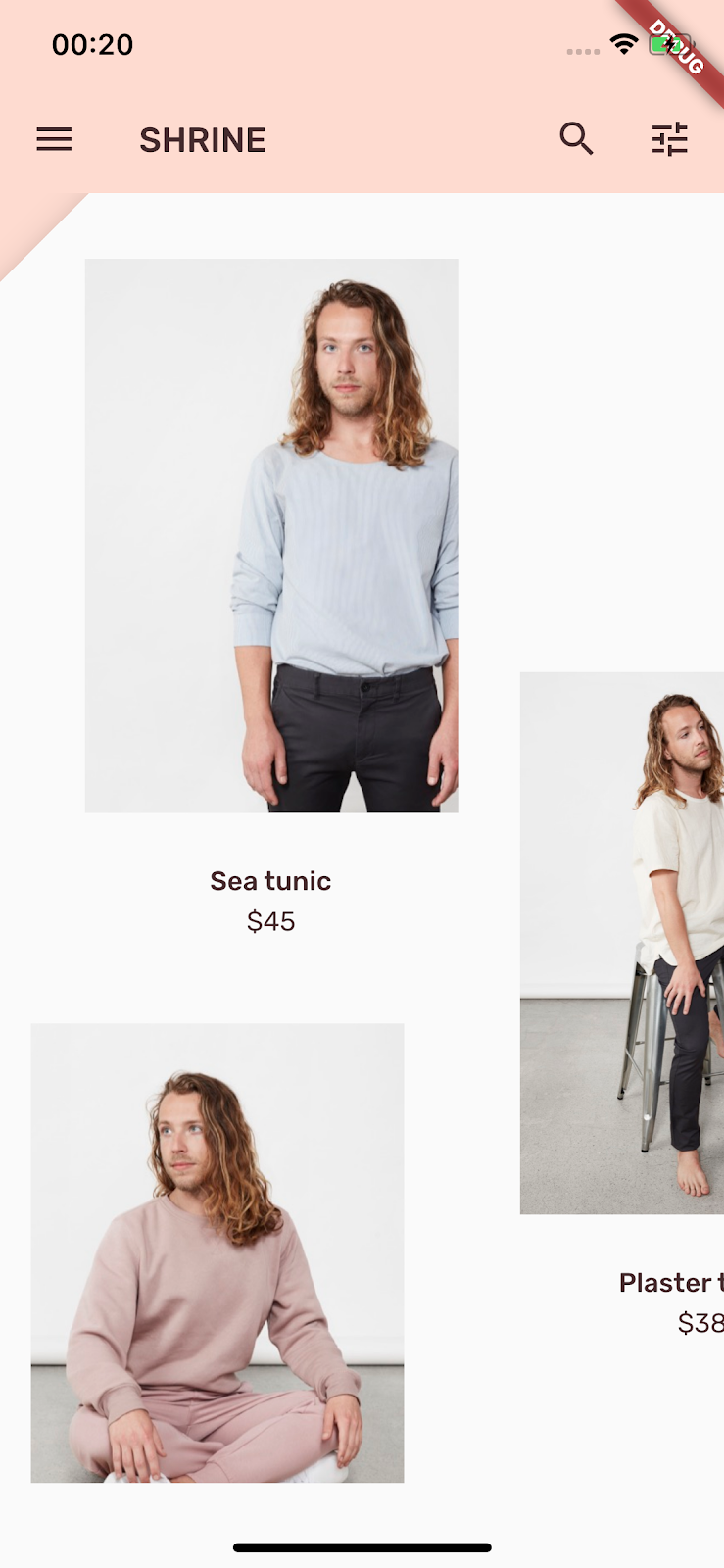
Tap the menu icon to view the products. They're filtered!
Close the front layer after a menu selection
In backdrop.dart, add an override for the didUpdateWidget() function in _BackdropState:
  // TODO: Add override for didUpdateWidget() (104)
  @override
  void didUpdateWidget(Backdrop old) {
    super.didUpdateWidget(old);

    if (widget.currentCategory != old.currentCategory) {
      _toggleBackdropLayerVisibility();
    } else if (!_frontLayerVisible) {
      _controller.fling(velocity: _kFlingVelocity);
    }
  }
Hot reload then tap the menu icon and select a category. The menu should close automatically and your should see the category of items selected. Now you'll add that functionality to the front layer too.
Toggle the front layer
In backdrop.dart, add an on-tap callback to the backdrop layer:
class _FrontLayer extends StatelessWidget {
  // TODO: Add on-tap callback (104)
  const _FrontLayer({
    Key key,
    this.onTap, // New code
    this.child,
  }) : super(key: key);

  final VoidCallback onTap; // New code
  final Widget child;
Then add a GestureDetector to the _FrontLayer's child: Column's children:.
      child: Column(
        crossAxisAlignment: CrossAxisAlignment.stretch,
        children: <Widget>[
          // TODO: Add a GestureDetector (104)
          GestureDetector(
            behavior: HitTestBehavior.opaque,
            onTap: onTap,
            child: Container(
              height: 40.0,
              alignment: AlignmentDirectional.centerStart,
            ),
          ),
          Expanded(
            child: child,
          ),
        ],
      ),
Then implement the new onTap property on the _BackdropState in the _buildStack() function:
          PositionedTransition(
            rect: layerAnimation,
            child: _FrontLayer(
              // TODO: Implement onTap property on _BackdropState (104)
              onTap: _toggleBackdropLayerVisibility,
              child: widget.frontLayer,
            ),
          ),
Reload and then tap on the top of the front layer. The layer should open and close each time you tap the top of the front layer.
Branded iconography extends to familiar icons too. Let's make the reveal icon custom and merge it with our title for a unique, branded look.
In backdrop.dart, create a new class _BackdropTitle.
// TODO: Add _BackdropTitle class (104)
class _BackdropTitle extends AnimatedWidget {
  final Function onPress;
  final Widget frontTitle;
  final Widget backTitle;

  const _BackdropTitle({
    Key key,
    Listenable listenable,
    this.onPress,
    @required this.frontTitle,
    @required this.backTitle,
  })  : assert(frontTitle != null),
        assert(backTitle != null),
        super(key: key, listenable: listenable);

  @override
  Widget build(BuildContext context) {
    final Animation<double> animation = this.listenable;

    return DefaultTextStyle(
      style: Theme.of(context).primaryTextTheme.title,
      softWrap: false,
      overflow: TextOverflow.ellipsis,
      child: Row(children: <Widget>[
        // branded icon
        SizedBox(
          width: 72.0,
          child: IconButton(
            padding: EdgeInsets.only(right: 8.0),
            onPressed: this.onPress,
            icon: Stack(children: <Widget>[
              Opacity(
                opacity: animation.value,
                child: ImageIcon(AssetImage('assets/slanted_menu.png')),
              ),
              FractionalTranslation(
                translation: Tween<Offset>(
                  begin: Offset.zero,
                  end: Offset(1.0, 0.0),
                ).evaluate(animation),
                child: ImageIcon(AssetImage('assets/diamond.png')),
              )]),
          ),
        ),
        // Here, we do a custom cross fade between backTitle and frontTitle.
        // This makes a smooth animation between the two texts.
        Stack(
          children: <Widget>[
            Opacity(
              opacity: CurvedAnimation(
                parent: ReverseAnimation(animation),
                curve: Interval(0.5, 1.0),
              ).value,
              child: FractionalTranslation(
                translation: Tween<Offset>(
                  begin: Offset.zero,
                  end: Offset(0.5, 0.0),
                ).evaluate(animation),
                child: backTitle,
              ),
            ),
            Opacity(
              opacity: CurvedAnimation(
                parent: animation,
                curve: Interval(0.5, 1.0),
              ).value,
              child: FractionalTranslation(
                translation: Tween<Offset>(
                  begin: Offset(-0.25, 0.0),
                  end: Offset.zero,
                ).evaluate(animation),
                child: frontTitle,
              ),
            ),
          ],
        )
      ]),
    );
  }
}
The _BackdropTitle is a custom widget that will replace the plain Text widget for the AppBar widget's title parameter. It has an animated menu icon and animated transitions between the front title and back title. The animated menu icon will use a new asset. The reference to the new slanted_menu.png must be added to the pubspec.yaml.
assets:
    - assets/diamond.png
    - assets/slanted_menu.png
    - packages/shrine_images/0-0.jpg
Remove the leading property in the AppBar builder. Removal is necessary for the custom branded icon to be rendered in the original leading widget's place. The animation listenable and the onPress handler for the branded icon are passed to the _BackdropTitle. The frontTitle and backTitle are also passed so that they can be rendered within the backdrop title. The title parameter of the AppBar should look like this:
// TODO: Create title with _BackdropTitle parameter (104)
title: _BackdropTitle(
  listenable: _controller.view,
  onPress: _toggleBackdropLayerVisibility,
  frontTitle: widget.frontTitle,
  backTitle: widget.backTitle,
),
The branded icon is created in the _BackdropTitle. It contains a Stack of animated icons: a slanted menu and a diamond, which is wrapped in an IconButton so that it can be pressed. The IconButton is then wrapped in a SizedBox in order to make room for the horizontal icon motion.
Flutter's "everything is a widget" architecture allows the layout of the default AppBar to be altered without having to create an entirely new custom AppBar widget. The title parameter, which is originally a Text widget, can be replaced with a more complex _BackdropTitle. Since the _BackdropTitle also includes the custom icon, it takes the place of the leading property, which can be now be omitted. This simple widget substitution is accomplished without changing any of the other parameters, such as the action icons, which continue to function on their own.
Add a shortcut back to the login screen
In backdrop.dart,add a shortcut back to the login screen from the two trailing icons in the app bar: Change the semantic labels of the icons to reflect their new purpose.
        // TODO: Add shortcut to login screen from trailing icons (104)
        IconButton(
          icon: Icon(
            Icons.search,
            semanticLabel: 'login', // New code
          ),
          onPressed: () {
            // TODO: Add open login (104)
            Navigator.push(
              context,
              MaterialPageRoute(builder: (BuildContext context) => LoginPage()),
            );
          },
        ),
        IconButton(
          icon: Icon(
            Icons.tune,
            semanticLabel: 'login', // New code
          ),
          onPressed: () {
            // TODO: Add open login (104)
            Navigator.push(
              context,
              MaterialPageRoute(builder: (BuildContext context) => LoginPage()),
            );
          },
        ),
You'll get an error if you try a reload. Import login.dart to fix the error:
import 'login.dart';Reload the app and tap the search or tune buttons to return to the login screen.
Over the course of these four codelabs, you've seen how to use Material Components to build unique, elegant user experiences that express brand personality and style.
Next steps
This codelab, MDC-104, completes this sequence of codelabs. You can explore even more components in MDC-Flutter by visiting the Flutter Widgets Catalog.
For a stretch goal, try replacing the branded icon with an AnimatedIcon.
To learn how to connect an app to Firebase for a working backend, see the codelab Firebase for Flutter.