What are Material Design and Material Components for Flutter?
Material Design is a system for building bold and beautiful digital products. By uniting style, branding, interaction, and motion under a consistent set of principles and components, product teams can realize their greatest design potential.
Material Components for Flutter (MDC-Flutter) unite design and engineering with a library of components that create a consistent user experience across apps and platforms. As the Material Design system evolves, these components are updated to ensure consistent pixel-perfect implementation, adhering to Google's front-end development standards. MDC is also available for Android, iOS, and the web.
In this codelab, you'll build a login page using several of MDC Flutter's components.
What you'll build
This codelab is the first of four codelabs that will guide you through building an app called Shrine, an e-commerce app that sells clothing and home goods. It will demonstrate how you can customize components to reflect any brand or style using MDC-Flutter.
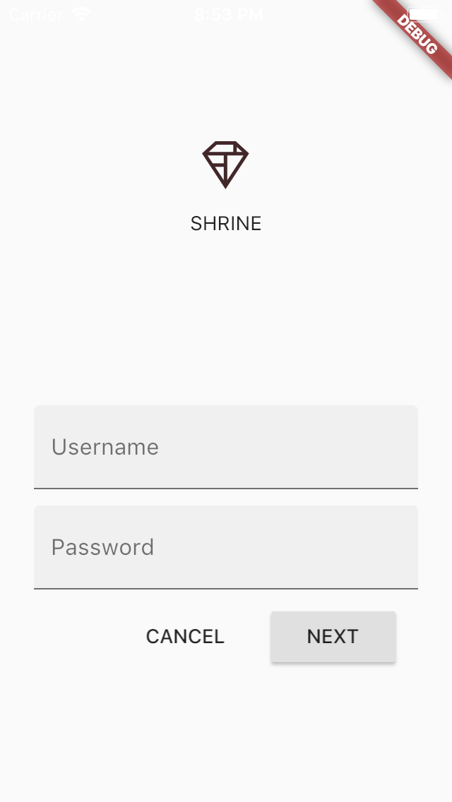
In this codelab, you'll build a login page for Shrine that contains:
- An image of Shrine's logo
- The name of the app (Shrine)
- Two text fields, one for entering a username and the other for a password
- Two buttons, one for "Cancel" and one for "Next"
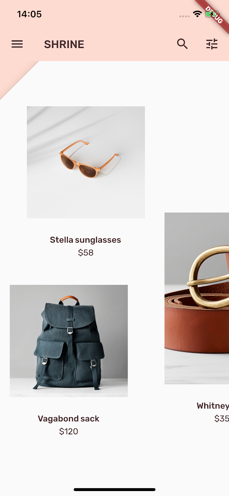
The related codelabs can be found at: | By the end of MDC-104, you'll build an app that looks like this:
|
MDC components in this codelab
- Text field
- Button
- Ripple
How would you rate your level of experience with Flutter development?
You need two pieces of software to complete this lab: the Flutter SDK, and an editor. This codelab assumes Android Studio, but you can use your preferred editor.
You can run this codelab using any of the following devices:
- A physical device (Android or iOS) connected to your computer and set to developer mode.
- The iOS simulator. (Requires installing XCode tools.)
- The Android emulator. (Requires setup in Android Studio.)
The starter project is located in the material-components-flutter-codelabs-101-starter/mdc_100_series directory.
...or clone it from GitHub
To clone this codelab from GitHub, run the following commands:
git clone https://github.com/material-components/material-components-flutter-codelabs.git
cd material-components-flutter-codelabs
git checkout 101-starter
Set up your project
The following instructions assume you're using Android Studio (IntelliJ).
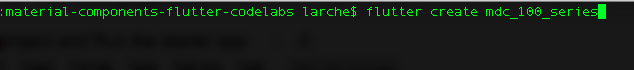
Create the project
1. In Terminal, navigate to | |
2. Run |
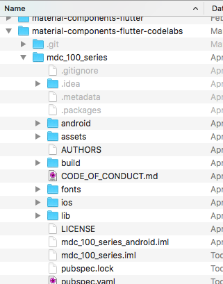
Open the project
1. Open Android Studio. | |
2. If you see the welcome screen, click Open an existing Android Studio project. | |
3. Navigate to the You can ignore any errors you see in analysis until you've built the project once. | |
4. In the project panel on the left, delete the testing file | |
5. If prompted, install any platform and plugin updates or FlutterRunConfigurationType, then restart Android Studio. |


Run the starter app
The following instructions assume you're testing on an Android emulator or device but you can also test on an iOS Simulator or device if you have Xcode installed.
1. Select the device or emulator. If the Android emulator is not already running, select Tools -> Android -> AVD Manager to create a virtual device and start the emulator. If an AVD already exists, you can start the emulator directly from the device selector in IntelliJ, as shown in the next step. (For the iOS Simulator, if it is not already running, launch the simulator on your development machine by selecting Flutter Device Selection -> Open iOS Simulator.) | |
2. Start your Flutter app:
|

 ).
).
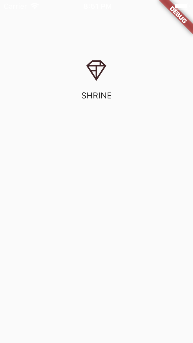
Success! The starter code for Shrine's login page should be running in your simulator. You should see the Shrine logo and the name "Shrine" just below it.
Let's look at the code.
Widgets in login.dart
Open up login.dart. It should contain this:
import 'package:flutter/material.dart';

class LoginPage extends StatefulWidget {
  @override
  _LoginPageState createState() => _LoginPageState();
}

class _LoginPageState extends State<LoginPage> {
  // TODO: Add text editing controllers (101)
  @override
  Widget build(BuildContext context) {
    return Scaffold(
      body: SafeArea(
        child: ListView(
          padding: EdgeInsets.symmetric(horizontal: 24.0),
          children: <Widget>[
            SizedBox(height: 80.0),
            Column(
              children: <Widget>[
                Image.asset('assets/diamond.png'),
                SizedBox(height: 16.0),
                Text('SHRINE'),
              ],
            ),
            SizedBox(height: 120.0),
            // TODO: Wrap Username with AccentColorOverride (103)
            // TODO: Remove filled: true values (103)
            // TODO: Wrap Password with AccentColorOverride (103)
            // TODO: Add TextField widgets (101)
            // TODO: Add button bar (101)
          ],
        ),
      ),
    );
  }
}

// TODO: Add AccentColorOverride (103)
Notice that it contains an import statement and two new classes:
- The
importstatement brings Material Components into this file. - The
LoginPageclass represents the entire page displayed in the simulator. - The
_LoginPageStateclass'sbuild()function controls how all the widgets in our UI are created.
To begin, we'll add two text fields to our login page, where users enter their username and password. We'll use the TextField widget, which displays a floating label and activates a touch ripple.
This page is structured primarily with a ListView, which arranges its children in a scrollable column. Let's place text fields at the bottom.
Add the TextField widgets
Add two new text fields and a spacer after SizedBox(height: 120.0).
// TODO: Add TextField widgets (101)
// [Name]
TextField(
decoration: InputDecoration(
filled: true,
labelText: 'Username',
),
),
// spacer
SizedBox(height: 12.0),
// [Password]
TextField(
decoration: InputDecoration(
filled: true,
labelText: 'Password',
),
obscureText: true,
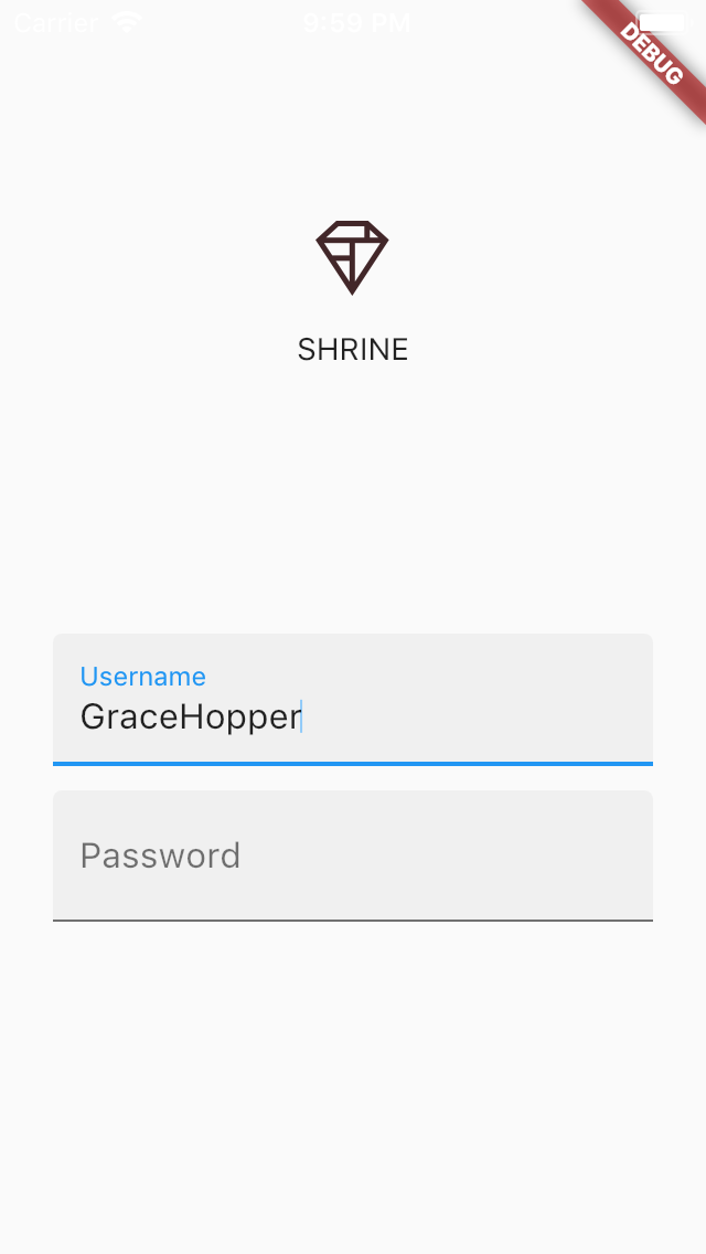
),The text fields each have a decoration: field that takes an InputDecoration widget. The filled: field means the background of the text field is lightly filled in to help people recognize the tap or touch target area of the text field. The second text field's obscureText: true value automatically replaces the input that the user types with bullets, which is appropriate for passwords.
Save your project (with the keystroke: command + s) which performs a hot reload.
You should now see a page with two text fields for Username and Password! Check out the floating label and ink ripple animations:
Next, we'll add two buttons to our login page: "Cancel" and "Next." We'll use two kinds of MDC button widgets: the FlatButton (called the "Text Button" in the Material Guidelines) and the RaisedButton (referred to as the "Contained Button").
Add the ButtonBar
After the text fields, add the ButtonBar to the ListView's children:
// TODO: Add button bar (101)
ButtonBar(
  // TODO: Add a beveled rectangular border to CANCEL (103)
  children: <Widget>[
    // TODO: Add buttons (101)
  ],
),
The ButtonBar arranges its children in a row.
Add the buttons
Then add two buttons to the ButtonBar's list of children:
    // TODO: Add buttons (101)
    FlatButton(
      child: Text('CANCEL'),
      onPressed: () {
        // TODO: Clear the text fields (101)
      },
    ),
    // TODO: Add an elevation to NEXT (103)
    // TODO: Add a beveled rectangular border to NEXT (103)
    RaisedButton(
      child: Text('NEXT'),
      onPressed: () {
    // TODO: Show the next page (101)
      },
    ),
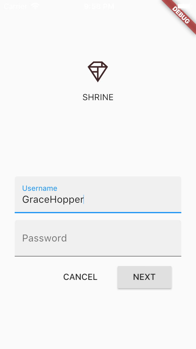
Save your project. Under the last text field, you should see two buttons appear:
The ButtonBar handles the layout work for you. It positions the buttons horizontally, so they appear next to one another, according to the padding in the current ButtonTheme. (You'll learn more about that in codelab MDC-103.)
Touching a button initiates an ink ripple animation, without causing anything else to happen. Let's add functionality into the anonymous onPressed: functions, so that the cancel button clears the text fields, and the next button dismisses the screen:
Add TextEditingControllers
To make it possible to clear the text fields' values, we'll add TextEditingControllers to control their text.
Right under the _LoginPageState class's declaration, add the controllers as final variables.
  // TODO: Add text editing controllers (101)
  final _usernameController = TextEditingController();
  final _passwordController = TextEditingController();
On the first text field's controller: field, set the _usernameController:
// [Name]
TextField(
  controller: _usernameController,
On the second text field's controller: field, now set the _passwordController:
// [Password]
TextField(
  controller: _passwordController,
Edit onPressed
Add a command to clear each controller in the FlatButton's onPressed: function:
    // TODO: Clear the text fields (101)
    _usernameController.clear();
    _passwordController.clear();
Save your project. Now when you type something into the text fields, hitting cancel clears each field again.
This login form is in good shape! Let's advance our users to the rest of the Shrine app.
Pop
To dismiss this view, we want to pop (or remove) this page (which Flutter calls a route) off the navigation stack.
In the RaisedButton's onPressed: function, pop the most recent route from the Navigator:
// TODO: Show the next page (101)
RaisedButton(
child: Text('NEXT'),
onPressed: () {
Navigator.pop(context);
},
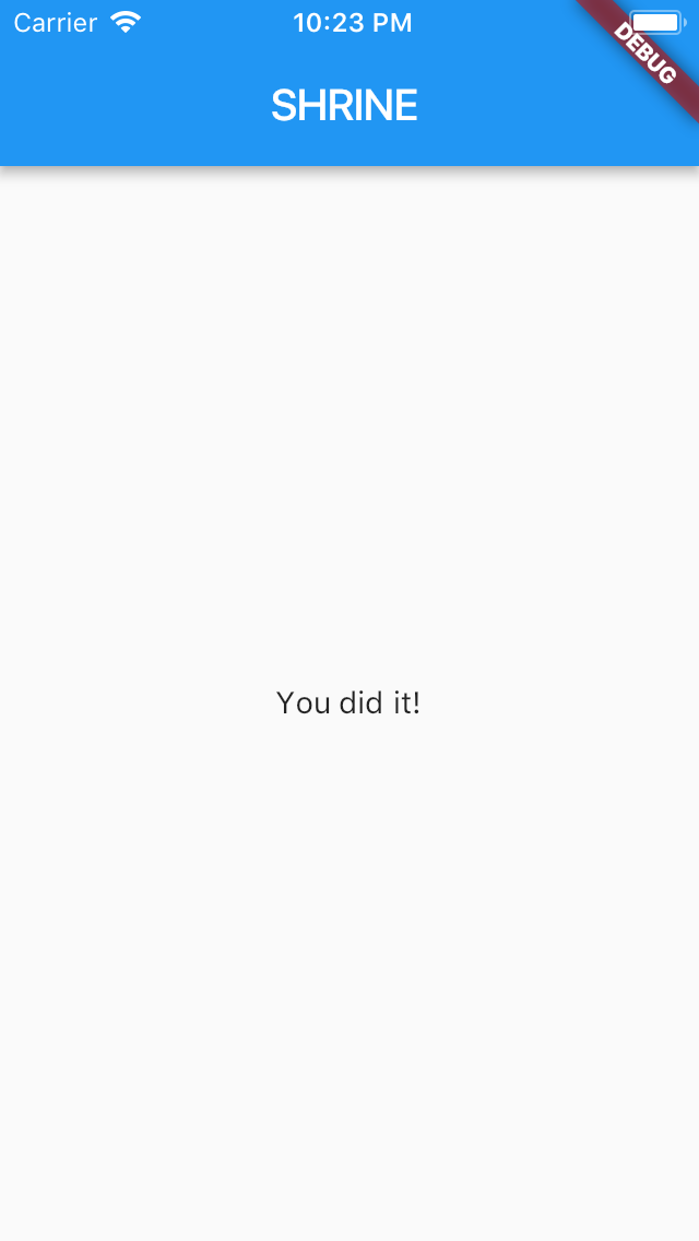
),That's it! Save the project. Go ahead and click "Next."
You did it!
This screen is the starting point for our next codelab, which you'll work on in MDC-102.
We added text fields and buttons and hardly had to consider layout code. Material Components for Flutter come with a lot of style and can be laid out almost effortlessly.
Next steps
Text fields and buttons are two core components in the Material System, but there are many more! You can also explore the rest of the widgets in Flutter's Material Components library.
Alternatively, head over to MDC-102: Material Design Structure and Layout to learn about the components covered in MDC-102 for Flutter.