Material Components (MDC) help developers implement Material Design. Created by a team of engineers and UX designers at Google, MDC features dozens of beautiful and functional UI components and is available for Android, iOS, web and Flutter. material.io/develop |

In codelab MDC-101, you used two Material Components to build a login page: text fields and buttons with ink ripples. Now let's expand upon this foundation by adding navigation, structure, and data.
What you'll build
In this codelab, you'll build a home screen for an app called Shrine, an e-commerce app that sells clothing and home goods. It will contain:
- A top app bar
- A grid list full of products

This is the second of 4 codelabs that will guide you through building an app for a product called Shrine. We recommend that you do all of the codelabs in order as they progress through tasks step-by-step. The related codelabs can be found at: | By the end of MDC-104, you'll build an app that looks like this:
|

MDC components in this codelab
- Top app bar
- Grids
- Cards
What you'll need
- The Flutter SDK
- Android Studio with Flutter plugins, or your favorite code editor
- The sample code
To build and run Flutter apps on iOS:
- A computer running macOS
- Xcode 9 or newer
- iOS Simulator, or a physical iOS device
To build and run Flutter apps on Android:
- A computer running macOS, Windows, or Linux
- Android Studio
- Android Emulator (comes with Android Studio), or a physical Android device
How would you rate your level of experience with Flutter development?
You need two pieces of software to complete this lab: the Flutter SDK, and an editor. This codelab assumes Android Studio, but you can use your preferred editor.
You can run this codelab using any of the following devices:
- A physical device (Android or iOS) connected to your computer and set to developer mode.
- The iOS simulator. (Requires installing XCode tools.)
- The Android emulator. (Requires setup in Android Studio.)
Continuing from MDC-101?
If you completed MDC-102, your code should be ready to go for this codelab. Skip to step: Add a top app bar.
Starting from scratch?
Download the starter codelab app
The starter app is located in the material-components-flutter-codelabs-102-starter_and_101-complete/mdc_100_series directory.
...or clone it from GitHub
To clone this codelab from GitHub, run the following commands:
git clone https://github.com/material-components/material-components-flutter-codelabs.git
cd material-components-flutter-codelabs
git checkout 102-starter_and_101-complete
Set up your project
The following instructions assume you're using Android Studio (IntelliJ).
Create the project
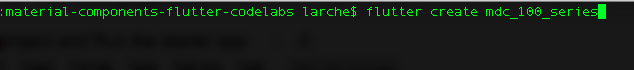
1. In Terminal, navigate to | |
2. Run |
Open the project
1. Open Android Studio. | |
2. If you see the welcome screen, click Open an existing Android Studio project. | |
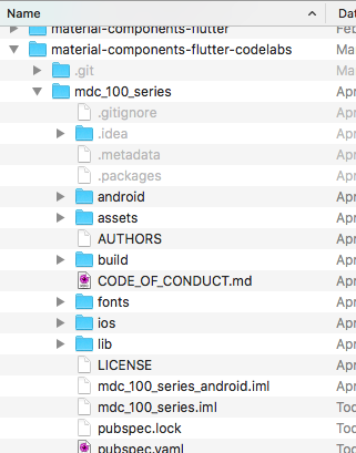
3. Navigate to the You can ignore any errors you see in analysis until you've built the project once. | |
4. In the project panel on the left, delete the testing file | |
5. If prompted, install any platform and plugin updates or FlutterRunConfigurationType, then restart Android Studio. |


Run the starter app
The following instructions assume you're testing on an Android emulator or device but you can also test on an iOS Simulator or device if you have Xcode installed.
1. Select the device or emulator. If the Android emulator is not already running, select Tools -> Android -> AVD Manager to create a virtual device and start the emulator. If an AVD already exists, you can start the emulator directly from the device selector in IntelliJ, as shown in the next step. (For the iOS Simulator, if it is not already running, launch the simulator on your development machine by selecting Flutter Device Selection -> Open iOS Simulator.) | |
2. Start your Flutter app:
|

 ).
).
Success! You should see the Shrine login page from the MDC-101 codelab in the simulator or emulator.

Now that the login screen looks good, let's populate the app with some products.
The home screen is revealed when the login page is dismissed, with a screen that says "You did it!". That's great! But now our user has no actions to take, or any sense of where they are in the app. To help with that, it's time to add navigation.
Material Design offers navigation patterns that ensure a high degree of usability. One of the most visible components is a top app bar.
To provide navigation and give users quick access to other actions, let's add a top app bar.
Add an AppBar widget
In home.dart, add an AppBar to the Scaffold:
return Scaffold(
  // TODO: Add app bar (102)
  appBar: AppBar(
    // TODO: Add buttons and title (102)
  ),
Adding the AppBar to the Scaffold's appBar: field, gives us perfect layout for free, keeping the AppBar at the top of the page and the body underneath.
Save the project. When the Shrine app updates, click Next to see the home screen.

AppBar looks great but it needs a title.
Add a Text widget
In home.dart, add a title to the AppBar:
// TODO: Add app bar (102)
  appBar: AppBar(
    // TODO: Add buttons and title (102)

    title: Text('SHRINE'),
        // TODO: Add trailing buttons (102)
Save the project.

Many app bars have a button next to the title. Let's add a menu icon in our app.
Add a leading IconButton
While still in home.dart, set an IconButton for the AppBar's leading: field. (Put it before the title: field to mimic the leading-to-trailing order):
return Scaffold(
  appBar: AppBar(
    // TODO: Add buttons and title (102)
    leading: IconButton(
      icon: Icon(
        Icons.menu,
        semanticLabel: 'menu',
      ),
      onPressed: () {
        print('Menu button');
      },
    ),
Save the project.

The menu icon (also known as the "hamburger") shows up right where you'd expect it.
You can also add buttons to the trailing side of the title. In Flutter, these are called "actions".
Add actions
There's room for two more IconButtons.
Add them to the AppBar instance after the title:
// TODO: Add trailing buttons (102)
actions: <Widget>[
  IconButton(
    icon: Icon(
      Icons.search,
      semanticLabel: 'search',
    ),
    onPressed: () {
      print('Search button');
    },
  ),
  IconButton(
    icon: Icon(
      Icons.tune,
      semanticLabel: 'filter',
    ),
    onPressed: () {
      print('Filter button');
    },
  ),
],
Save your project. Your home screen should look like this:

Now the app has a leading button, a title, and two actions on the right side. The app bar also displays elevation using a subtle shadow that shows it's on a different layer than the content.
Now that our app has some structure, let's organize the content by placing it into cards.
Add a GridView
Let's start by adding one card underneath the top app bar. The Card widget alone doesn't have enough information to lay itself out where we could see it, so we'll want to encapsulate it in a GridView widget.
Replace the Center in the body of the Scaffold with a GridView:
// TODO: Add a grid view (102)
body: GridView.count(
  crossAxisCount: 2,
  padding: EdgeInsets.all(16.0),
  childAspectRatio: 8.0 / 9.0,
  // TODO: Build a grid of cards (102)
  children: <Widget>[Card()],
),
Let's unpack that code. The GridView invokes the count() constructor since the number of items it displays is countable and not infinite. But it needs some information to define its layout.
The crossAxisCount: specifies how many items across. We want 2 columns.
The padding: field provides space on all 4 sides of the GridView. Of course you can't see the padding on the trailing or bottom sides because there's no GridView children next to them yet.
The childAspectRatio: field identifies the size of the items based on an aspect ratio (width over height).
By default, GridView makes tiles that are all the same size.
Adding that all together, the GridView calculates each child's width as follows: ([width of the entire grid] - [left padding] - [right padding]) / number of columns. Using the values we have: ([width of the entire grid] - 16 - 16) / 2.
The height is calculated from the width, by applying the aspect ratio:: ([width of the entire grid] - 16 - 16) / 2 * 9 / 8. We flipped 8 and 9 because we are starting with the width and calculating the height and not the other way around.
We have one card but it's empty. Let's add child widgets to our card.
Layout the contents
Cards should have regions for an image, a title, and secondary text.
Update the children of the GridView:
// TODO: Build a grid of cards (102)
children: <Widget>[
  Card(
    child: Column(
      crossAxisAlignment: CrossAxisAlignment.start,
      children: <Widget>[
        AspectRatio(
          aspectRatio: 18.0 / 11.0,
          child: Image.asset('assets/diamond.png'),
        ),
        Padding(
          padding: EdgeInsets.fromLTRB(16.0, 12.0, 16.0, 8.0),
          child: Column(
            crossAxisAlignment: CrossAxisAlignment.start,
            children: <Widget>[
              Text('Title'),
              SizedBox(height: 8.0),
              Text('Secondary Text'),
            ],
          ),
        ),
      ],
    ),
  )
],
This code adds a Column widget used to lay out the child widgets vertically.
The crossAxisAlignment: field specifies CrossAxisAlignment.start, which means "align the text to the leading edge."
The AspectRatio widget decides what shape the image takes no matter what kind of image is supplied.
The Padding brings the text in from the side a little.
The two Text widgets are stacked vertically with 8 points of empty space between them (SizedBox). We make another Column to house them inside the Padding.
Save your project:

In this preview, you can see the card is inset from the edge, with rounded corners, and a shadow (that expresses the card's elevation). The entire shape is called the "container" in Material. (Not to be confused with the actual widget class called Container.)
Cards are usually shown in a collection with other cards. Let's lay them out as a collection in a grid.
Whenever multiple cards are present in a screen, they are grouped together into one or more collections. Cards in a collection are coplanar, meaning cards share the same resting elevation as one another (unless the cards are picked up or dragged, but we won't be doing that here).
Multiply the card into a collection
Right now our Card is constructed inline of the children: field of the GridView. That's a lot of nested code that can be hard to read. Let's extract it into a function that can generate as many empty cards as we want, and returns a list of Cards..
Make a new private function after the build() function (remember that functions starting with an underscore are private API):
// TODO: Make a collection of cards (102)
List<Card> _buildGridCards(int count) {
  List<Card> cards = List.generate(
    count,
    (int index) => Card(
      child: Column(
        crossAxisAlignment: CrossAxisAlignment.start,
        children: <Widget>[
          AspectRatio(
            aspectRatio: 18.0 / 11.0,
            child: Image.asset('assets/diamond.png'),
          ),
          Padding(
            padding: EdgeInsets.fromLTRB(16.0, 12.0, 16.0, 8.0),
            child: Column(
              crossAxisAlignment: CrossAxisAlignment.start,
              children: <Widget>[
                Text('Title'),
                SizedBox(height: 8.0),
                Text('Secondary Text'),
              ],
            ),
          ),
        ],
      ),
    ),
  );

  return cards;
}
Assign the generated cards to GridView's children field. Remember to replace everything contained in the GridView with this new code:
// TODO: Add a grid view (102)
body: GridView.count(
  crossAxisCount: 2,
  padding: EdgeInsets.all(16.0),
  childAspectRatio: 8.0 / 9.0,
  children: _buildGridCards(10) // Replace
),
Save the project:
The cards are there, but they don't show anything yet. Now's the time to add some product data.
Add product data
The app has some products with images, names, and prices. Let's add that to the widgets we have in the card already
Then, in home.dart, import a new package and some files we supplied for a data model:
import 'package:flutter/material.dart';
import 'package:intl/intl.dart';

import 'model/products_repository.dart';
import 'model/product.dart';
Finally, change _buildGridCards() to fetch the product info, and use that data in the cards:
// TODO: Make a collection of cards (102)

// Replace this entire method
List<Card> _buildGridCards(BuildContext context) {
  List<Product> products = ProductsRepository.loadProducts(Category.all);

  if (products == null || products.isEmpty) {
    return const <Card>[];
  }

  final ThemeData theme = Theme.of(context);
  final NumberFormat formatter = NumberFormat.simpleCurrency(
      locale: Localizations.localeOf(context).toString());

  return products.map((product) {
    return Card(
      // TODO: Adjust card heights (103)
      child: Column(
        // TODO: Center items on the card (103)
        crossAxisAlignment: CrossAxisAlignment.start,
        children: <Widget>[
          AspectRatio(
            aspectRatio: 18 / 11,
            child: Image.asset(
              product.assetName,
              package: product.assetPackage,
             // TODO: Adjust the box size (102)
            ),
          ),
          Expanded(
            child: Padding(
              padding: EdgeInsets.fromLTRB(16.0, 12.0, 16.0, 8.0),
              child: Column(
               // TODO: Align labels to the bottom and center (103)
               crossAxisAlignment: CrossAxisAlignment.start,
                // TODO: Change innermost Column (103)
                children: <Widget>[
                 // TODO: Handle overflowing labels (103)
                 Text(
                    product.name,
                    style: theme.textTheme.title,
                    maxLines: 1,
                  ),
                  SizedBox(height: 8.0),
                  Text(
                    formatter.format(product.price),
                    style: theme.textTheme.body2,
                  ),
                ],
              ),
            ),
          ),
        ],
      ),
    );
  }).toList();
}
NOTE: Won't compile and run yet. We have one more change.
Also, change the build() function to pass the BuildContext to _buildGridCards() before you try to compile:
// TODO: Add a grid view (102)
body: GridView.count(
  crossAxisCount: 2,
  padding: EdgeInsets.all(16.0),
  childAspectRatio: 8.0 / 9.0,
  children: _buildGridCards(context) // Changed code
),
You may notice we don't add any vertical space between the cards. That's because they have, by default, 4 points of padding on their top and bottom.
Save your project:
The product data shows up, but the images have extra space around them. The images are drawn with a BoxFit of .scaleDown by default (in this case.) Let's change that to .fitWidth so they zoom in a little and remove the extra whitespace.
Change the image's fit: field:
  // TODO: Adjust the box size (102)
  fit: BoxFit.fitWidth,
Our products are now showing up in the app perfectly!
Our app has a basic flow that takes the user from the login screen to a home screen, where products can be viewed. In just a few lines of code, we added a top app bar (with a title and three buttons) and cards (to present our app's content). Our home screen is now simple and functional, with a basic structure and actionable content.
Next steps
With the top app bar, card, text field, and button, we've now used four core components from the MDC-Flutter library! You can explore even more components by visiting the Flutter Widgets Catalog.
While it's fully functioning, our app doesn't yet express any particular brand or point of view. In MDC-103: Material Design Theming with Color, Shape, Elevation and Type, we'll customize the style of these components to express a vibrant, modern brand.