Flutter is an open source SDK for creating high-performance, high-fidelity mobile apps for iOS and Android. The Flutter framework makes it easy for you to build user interfaces that react smoothly in your app, while reducing the amount of code required to synchronize and update your app's view.
Flutter makes it easy to get started building beautiful apps, with its rich set of Material Design and Cupertino (iOS) widgets and behaviors. Your users will love your app's natural look and feel, because Flutter implements platform-specific scrolling, navigational patterns, fonts, and more. You'll feel powerful and productive with Flutter's functional-reactive framework and our extremely fast hot reloads on devices and emulators.
You'll write your Flutter apps in Dart. Dart syntax should look familiar if you already know Java, JavaScript, C#, or Swift. Dart is compiled using the standard Android and iOS toolchains for the specific mobile platform where your app needs to run. You get all the benefits of the Dart language, including familiar and terse syntax, first-class functions, async/await, rich standard libraries, and more.
This codelab provides a deeper dive into Flutter than Write Your First Flutter App, part 1, and part 2. If you want a gentler introduction to Flutter, start with those.
What you'll learn
- How to write a Flutter app that looks natural on both iOS and Android.
- How to debug your Flutter app.
- How to run your Flutter app on a simulator/emulator and on a device.
What is your level of experience with building mobile apps?
You need two pieces of software to complete this lab: the Flutter SDK, and an editor. This codelab assumes Android Studio, but you can use your preferred editor.
You can run this codelab using any of the following devices:
- A physical device (Android or iOS) connected to your computer and set to developer mode.
- The iOS simulator. (Requires installing XCode tools.)
- The Android emulator. (Requires setup in Android Studio.)
Create a simple templated Flutter app, using the instructions in Getting Started with your first Flutter app. Name the project friendlychat (instead of myapp). You'll be modifying this starter app to create the finished app.
In these codelabs, you'll mostly be editing lib/main.dart, where the Dart code lives.
In this section, you'll begin modifying the default sample app into a chat app. The goal is to use Flutter to build Friendlychat, a simple, extensible chat app with these features:
- The app displays text messages in real time.
- Users can enter a text string message and send it either by pressing the return key or the Send icon.
- The UI runs on both iOS and Android devices.
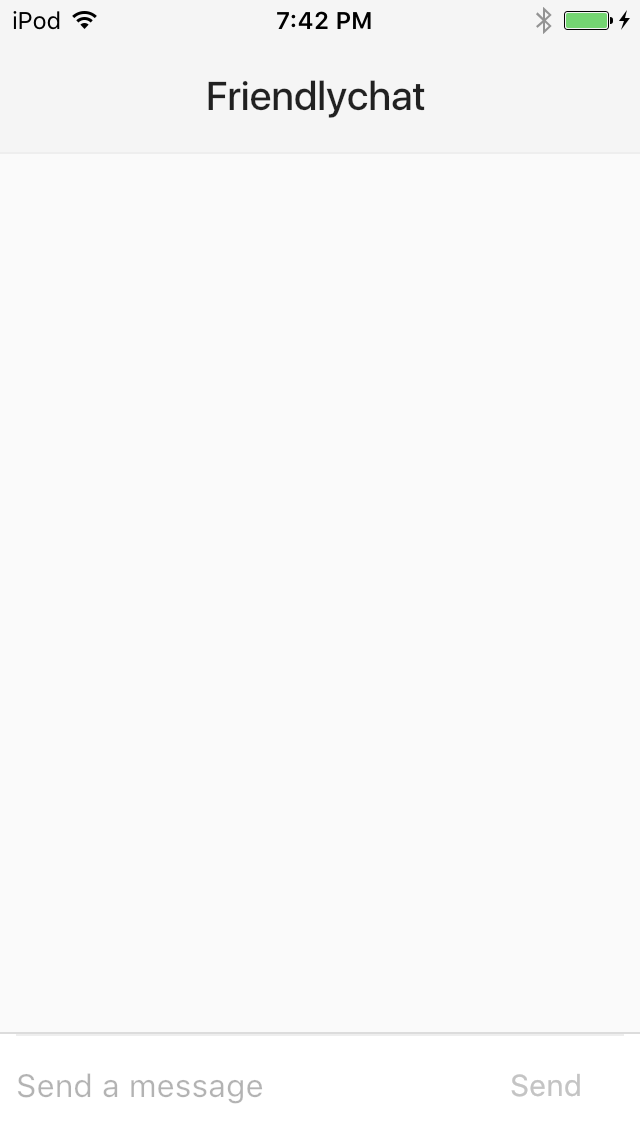
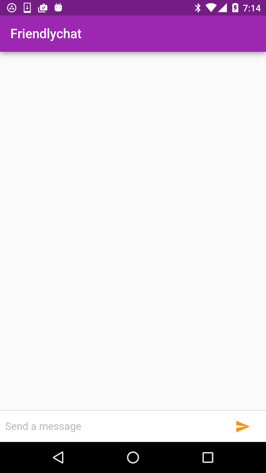
iOS | Android |
|
|
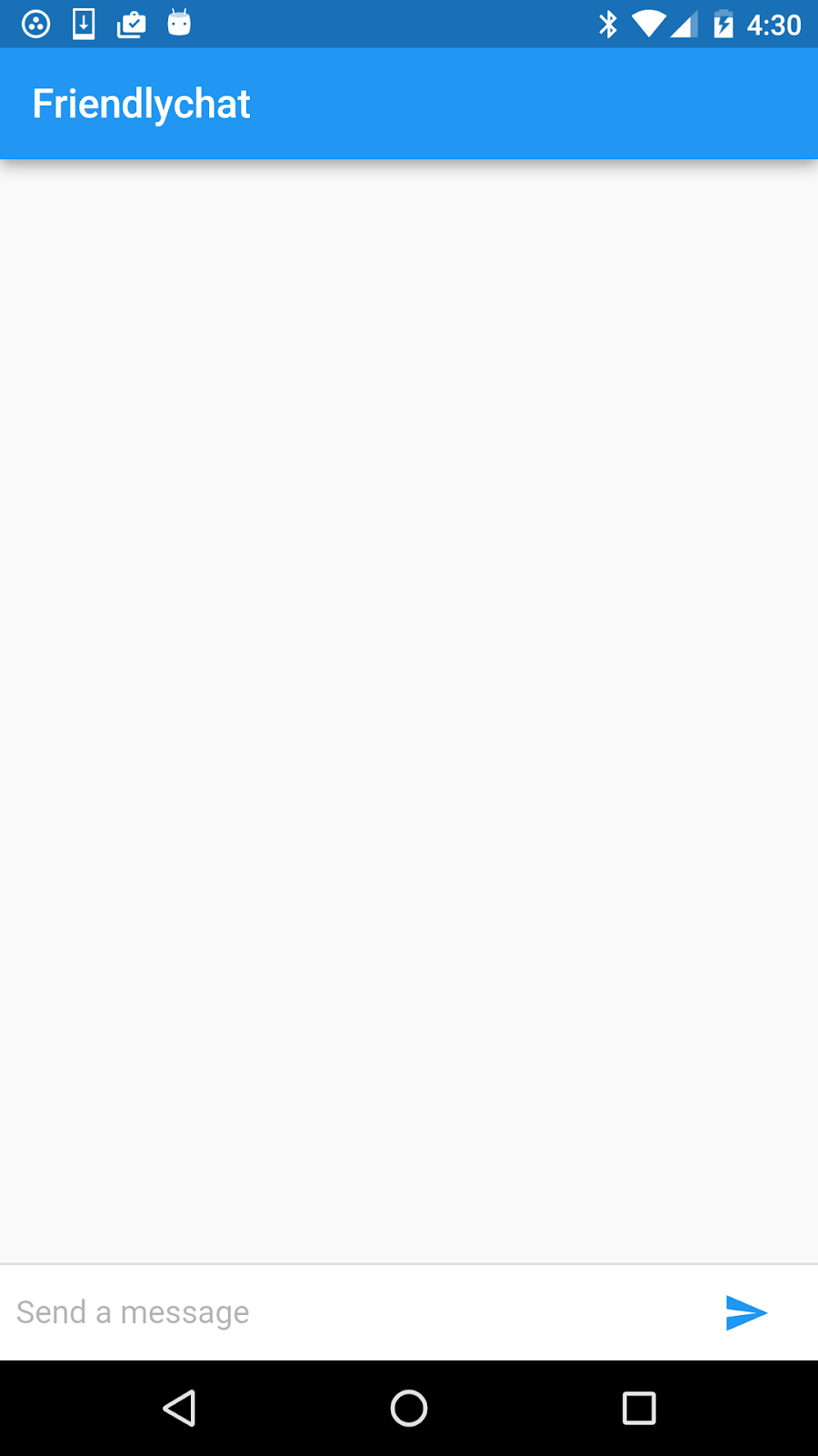
Create the main app scaffold
The first element you'll add is a simple app bar that shows a static title for the app. As you progress through subsequent sections of this codelab, you'll incrementally add more responsive and stateful UI elements to the app.
The main.dart file is located under the lib directory in your Flutter project and contains the main() function that starts the execution of your app.
The main() and runApp() function definitions are the same as in the default app. The runApp() function takes as its argument a Widget which the Flutter framework expands and displays to the screen of the app at run time. Since the app uses Material Design elements in the UI, create a new MaterialApp object and pass it to the runApp() function; this widget becomes the root of your widget tree.
main.dart
// Replace the code in main.dart with the following.

import 'package:flutter/material.dart';

void main() {
  runApp(
    new MaterialApp(
      title: "Friendlychat",
      home: new Scaffold(
        appBar: new AppBar(
          title: new Text("Friendlychat"),
        ),
      ),
    ),
  );
}
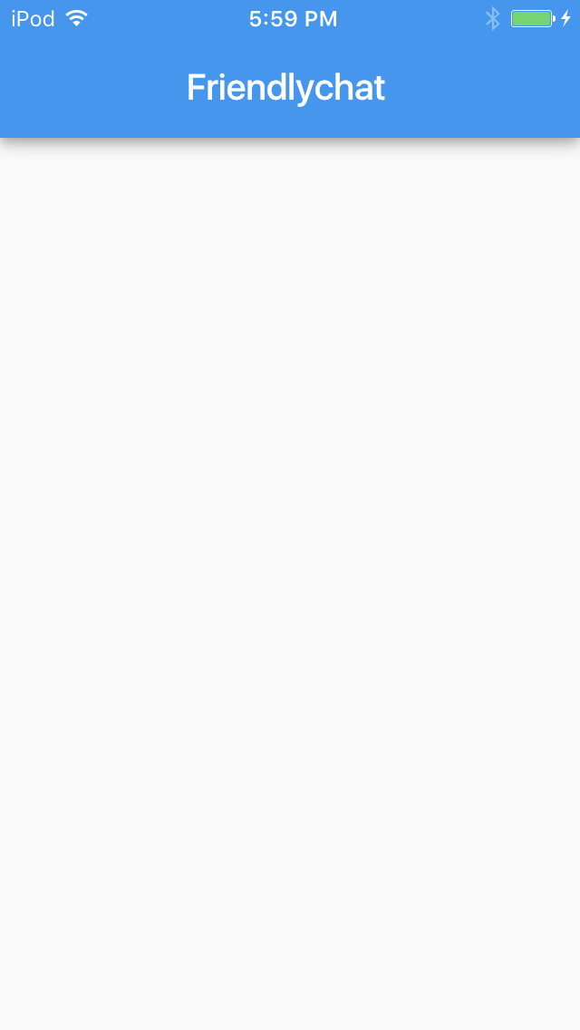
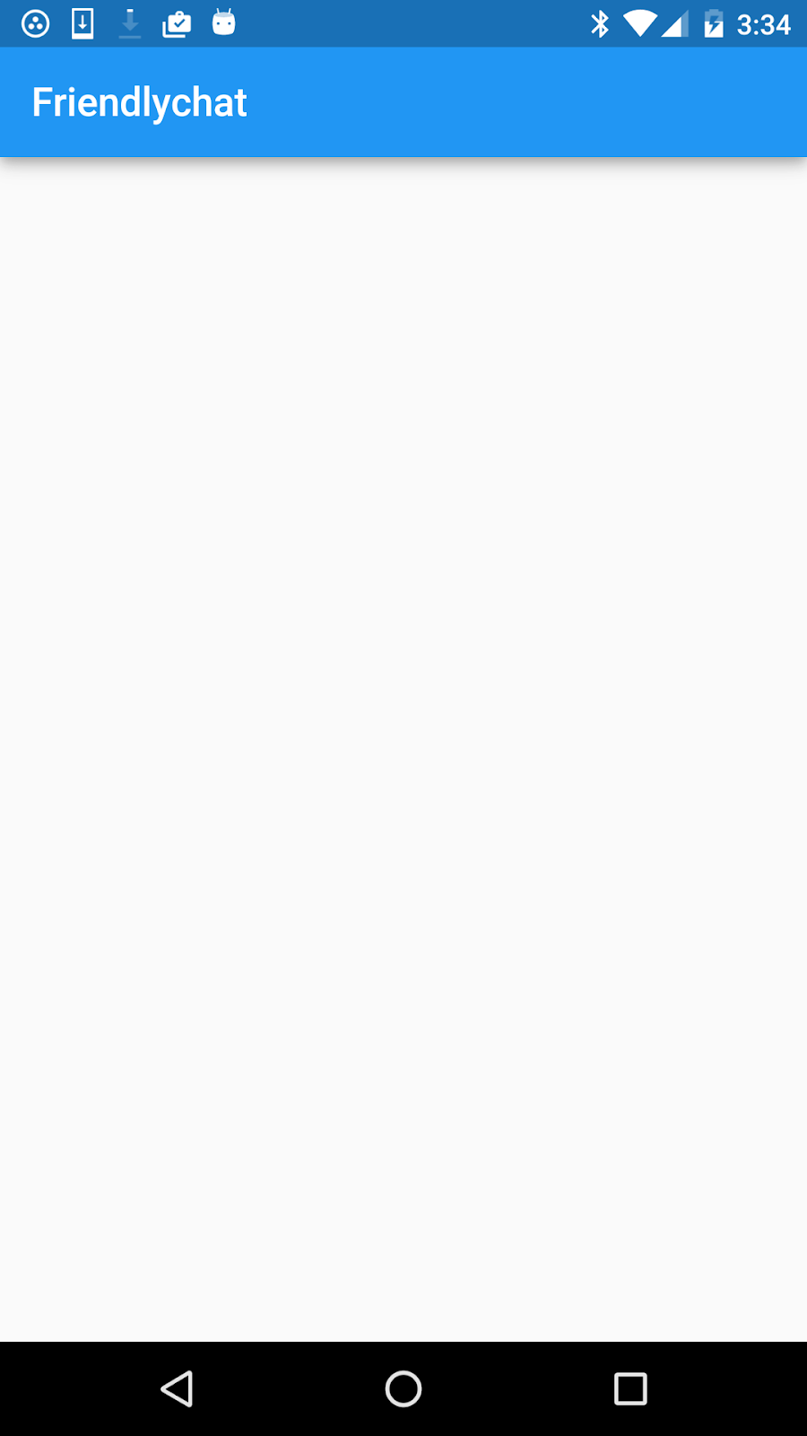
To specify the default screen that users see in your app, set the home argument in your MaterialApp definition. The home argument references a widget that defines the main UI for this app. The widget consists of a Scaffold widget that has a simple AppBar as its child widget.
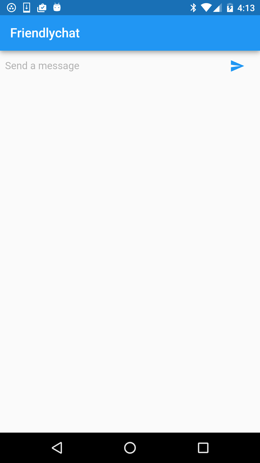
If you run the app ( ), you should see a single screen that looks like this.
iOS | Android |
|
|
Build the chat screen
To lay the groundwork for interactive components, you'll break the simple app into two different subclasses of widget: a root-level FriendlychatApp widget that never changes, and a child ChatScreen widget that can rebuild when messages are sent and internal state changes. For now, both these classes can extend StatelessWidget. Later, we'll modify ChatScreen to extend StatefulWidget and manage state.
main.dart
// Replace the code in main.dart with the following.

import 'package:flutter/material.dart';

void main() {
  runApp(new FriendlychatApp());
}

class FriendlychatApp extends StatelessWidget {
  @override
  Widget build(BuildContext context) {
    return new MaterialApp(
      title: "Friendlychat",
      home: new ChatScreen(),
    );
  }
}

class ChatScreen extends StatelessWidget {
  @override
  Widget build(BuildContext context) {
    return new Scaffold(
      appBar: new AppBar(title: new Text("Friendlychat")),
    );
  }
}
This step introduces several key concepts of the Flutter framework:
- You describe the part of the user interface represented by a widget in its build method. The framework calls the
build()methods forFriendlychatApporChatScreenwhen inserting these widgets into the widget hierarchy and when their dependencies change. @overrideis a Dart annotation that indicates that the tagged method overrides a superclass's method.- Some widgets, like
ScaffoldandAppBar, are specific to Material Design apps. Other widgets, likeText, are generic and can be used in any app. Widgets from different libraries in the Flutter framework are compatible and can work together in a single app.
Click the hot reload ( ) button to see the changes almost instantly. After dividing the UI into separate classes and modifying the root widget, you should see no change:
iOS | Android |
|
|
In this section, you'll learn how to build a user control that enables the user to enter and send text messages.
On a device, clicking on the text field brings up a soft keyboard. Users can send chat messages by typing a non-empty string and pressing the Return key on the soft keyboard. Alternatively, users can send their typed messages by pressing the graphical Send button next to the input field.
For now, the UI for composing messages is at the top of the chat screen but after we add the UI for displaying messages in the next step, it will move to the bottom of the chat screen.
Add an interactive text input field
The Flutter framework provides a Material Design widget called TextField. It's a stateful widget (a widget that has mutable state) with properties for customizing the behavior of the input field. State is information that can be read synchronously when the widget is built and that might change during the lifetime of the widget. Adding the first stateful widget to Friendlychat requires making a few modifications.
In Flutter, if you want to visually present stateful data in a widget, you should encapsulate this data in a State object. You can then associate your State object with a widget that extends the StatefulWidget class.
The following code snippet shows how you might start to define a class in your main.dart file to add the interactive text input field. First you'll change the ChatScreen class to subclass StatefulWidget instead of StatelessWidget. While TextField handles the mutable text content, state belongs at this level of the widget hierarchy because ChatScreen will have a text controller object. You'll also define a new ChatScreenState class that implements the State object.
Override the createState() method as shown to attach the ChatScreenState class. You'll use the new class to build the stateful TextField widget.
Add a line above the build() method to define the ChatScreenState class:
main.dart
// Modify the ChatScreen class definition to extend StatefulWidget.

class ChatScreen extends StatefulWidget {                     //modified
  @override                                                        //new
  State createState() => new ChatScreenState();                    //new
}

// Add the ChatScreenState class definition in main.dart.

class ChatScreenState extends State<ChatScreen> {                  //new
  @override                                                        //new
  Widget build(BuildContext context) {
    return new Scaffold(
      appBar: new AppBar(title: new Text("Friendlychat")),

    );
  }
}
Now the build() method for ChatScreenState should include all the widgets formerly in the ChatScreen part of the widget tree. When the framework calls the build() method to refresh the UI, it can rebuild ChatScreenState with its tree of children widgets.
Now that your app has the ability to manage state, you can build out the ChatScreenState class with an input field and send button.
To manage interactions with the text field, it's helpful to use a TextEditingController object. You'll use it for reading the contents of the input field, and for clearing the field after the text message is sent. Add a line to the ChatScreenState class definition to create this object.
main.dart
// Add the following code in the ChatScreenState class definition.

class ChatScreenState extends State<ChatScreen> {
  final TextEditingController _textController = new TextEditingController(); //new
The following code snippet shows how you can define a private method called _buildTextComposer() that returns a Container widget with a configured TextField widget.
main.dart
// Add the following code in the ChatScreenState class definition.

Widget _buildTextComposer() {
  return new Container(
    margin: const EdgeInsets.symmetric(horizontal: 8.0),
    child: new TextField(
      controller: _textController,
      onSubmitted: _handleSubmitted,
      decoration: new InputDecoration.collapsed(
        hintText: "Send a message"),
    ),
  );
}
Start with a Container widget that adds a horizontal margin between the edge of the screen and each side of the input field. The units here are logical pixels that get translated into a specific number of physical pixels, depending on a device's pixel ratio. You might be familiar with the equivalent term for iOS (points) or for Android (density-independent pixels).
Add a TextField widget and configure it as follows to manage user interactions:
- To have control over the contents of the text field, we'll provide the
TextFieldconstructor with aTextEditingController. This controller can also be used to clear the field or read its value. - To be notified when the user submits a message, use the
onSubmittedargument to provide a private callback method_handleSubmitted(). For now, this method will just clear the field, and later on we'll add more to code to send the message. Define this method as follows:
main.dart
// Add the following code in the ChatScreenState class definition.

void _handleSubmitted(String text) {
  _textController.clear();
}Place the text composer widget
Now, tell the app how to display the text input user control. In the build() method of your ChatScreenState class, attach a private method called _buildTextComposer to the body property. The _buildTextComposer method returns a widget that encapsulates the text input field.
main.dart
// Modify the code in the ChatScreenState class definition as follows.

  @override
  Widget build(BuildContext context) {
    return new Scaffold(
      appBar: new AppBar(title: new Text("Friendlychat")),

      body: _buildTextComposer(), //new
    );
  }
Hot reload the app. You should see a single screen that looks like this.
iOS | Android |
|
|
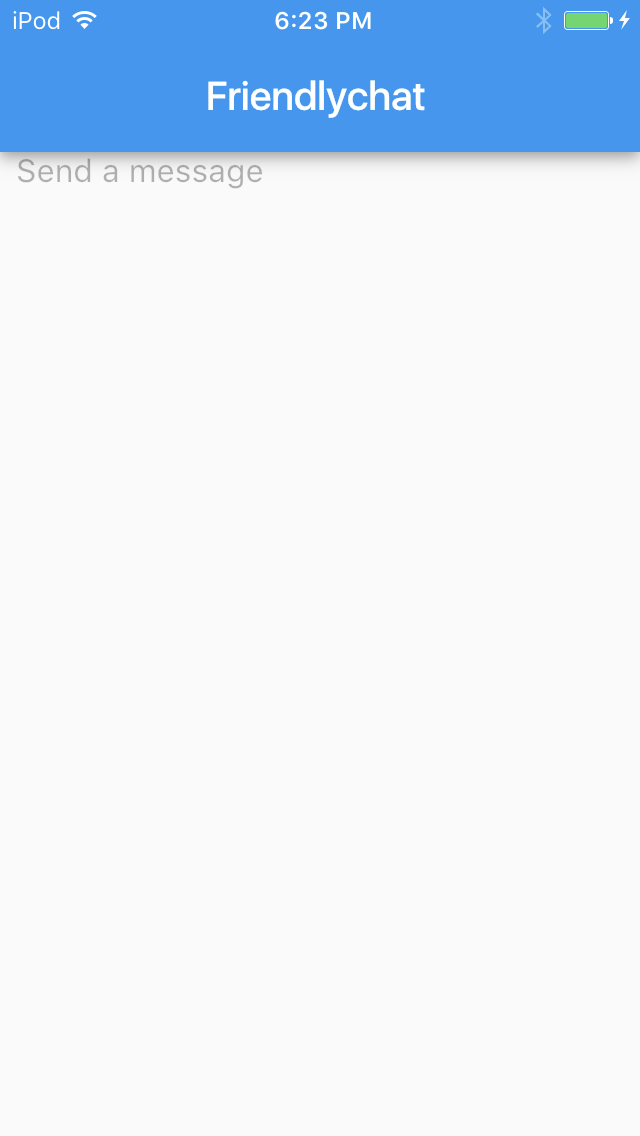
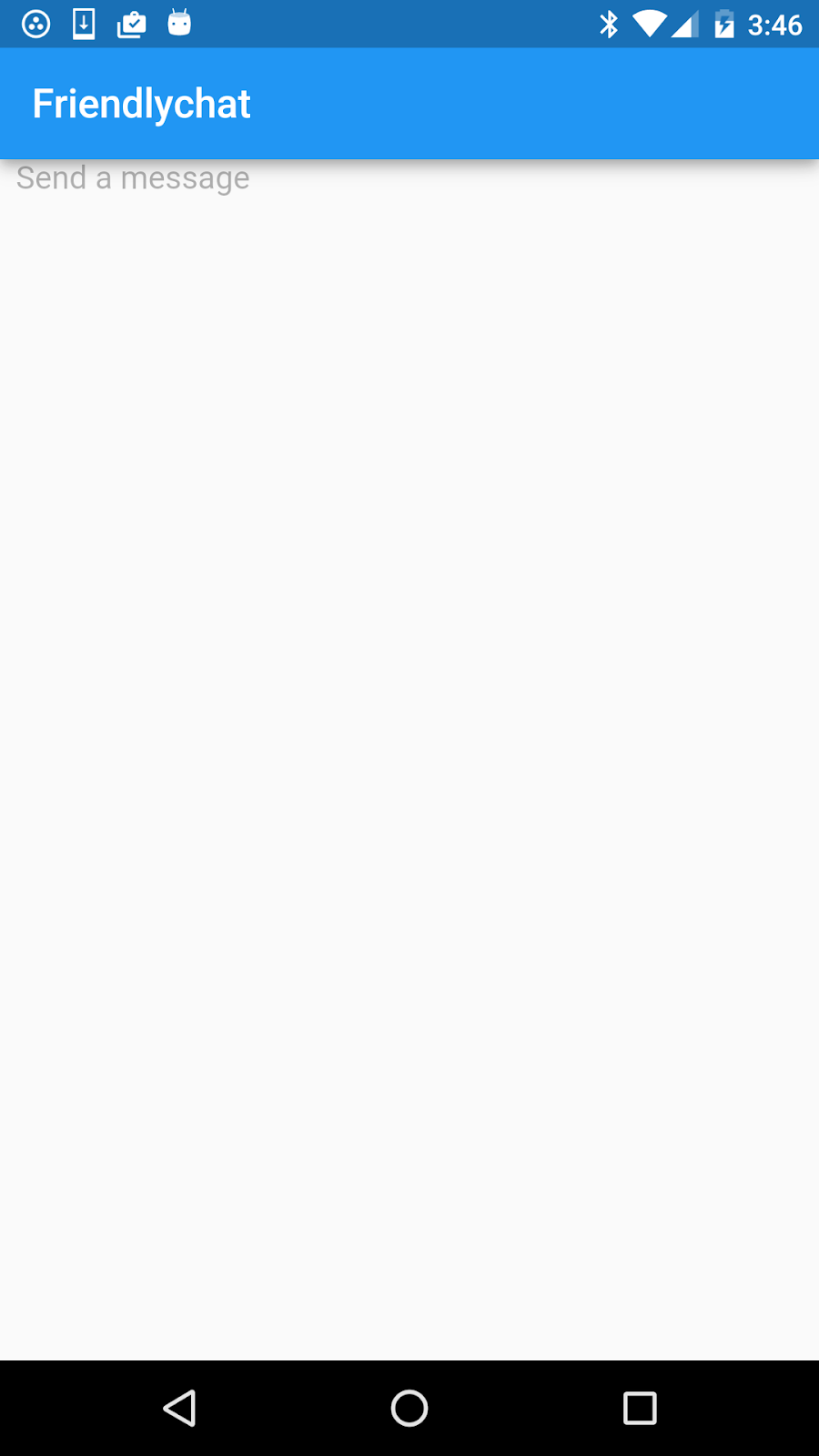
Add a responsive Send button
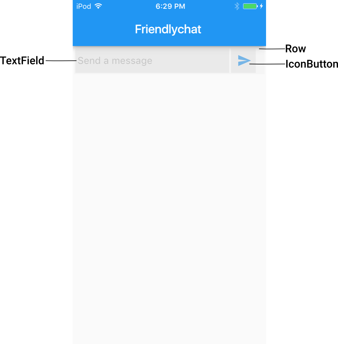
Next, we'll add a ‘Send' button to the right of the text field. Since we want to display the button adjacent to the input field, we'll use a Row widget as the parent.
Then wrap the TextField widget in a Flexible widget. This tells the Row to automatically size the text field to use the remaining space that isn't used by the button.
main.dart
// Modify the _buildTextComposer method with the code below to arrange the
// text input field and send button.

Widget _buildTextComposer() {
  return new Container(
    margin: const EdgeInsets.symmetric(horizontal: 8.0),
    child: new Row(                                            //new
      children: <Widget>[                                      //new
        new Flexible(                                          //new
          child: new TextField(
            controller: _textController,
            onSubmitted: _handleSubmitted,
            decoration: new InputDecoration.collapsed(
              hintText: "Send a message"),
          ),
        ),                                                      //new
      ],                                                        //new
    ),                                                          //new
  );
}
You can now create an IconButton widget that displays the Send icon. In the icon property, use the Icons.send constant to create a new Icon instance. This constant indicates that your widget uses the following ‘Send' icon provided by the material icons library.

Put your IconButton widget inside another Container parent widget; this lets you customize the margin spacing of the button so that it visually fits better next to your input field. For the onPressed property, use an anonymous function to also invoke the _handleSubmitted() method and use _textController to pass it the contents of the message.
main.dart
// Modify the _buildTextComposer method with the code below to define the
// send button.

Widget _buildTextComposer() {
  return new Container(
    margin: const EdgeInsets.symmetric(horizontal: 8.0),
    child: new Row(
      children: <Widget>[
        new Flexible(
          child: new TextField(
            controller: _textController,
            onSubmitted: _handleSubmitted,
            decoration: new InputDecoration.collapsed(
              hintText: "Send a message"),
          ),
        ),
        new Container(                                                 //new
          margin: new EdgeInsets.symmetric(horizontal: 4.0),           //new
          child: new IconButton(                                       //new
            icon: new Icon(Icons.send),                                //new
            onPressed: () => _handleSubmitted(_textController.text)),  //new
        ),                                                             //new
      ],
    ),
  );
}The color of the button is black, from the default Material Design theme. To give the icons in your app an accent color, pass the color argument to IconButton. Alternatively, you can apply a different theme.
Icons inherit their color, opacity, and size from an IconTheme widget, which uses an IconThemeData object to define these characteristics. Wrap all the widgets in the _buildTextComposer() method in an IconTheme widget, and use its data property to specify the ThemeData object of the current theme. This gives the button (and any other icons in this part of the widget tree) the accent color of the current theme.
main.dart
// Modify the _buildTextComposer method with the code below to give the
// send button the current theme's accent color.

Widget _buildTextComposer() {
  return new IconTheme(                                            //new
    data: new IconThemeData(color: Theme.of(context).accentColor), //new
    child: new Container(                                     //modified
      margin: const EdgeInsets.symmetric(horizontal: 8.0),
      child: new Row(
        children: <Widget>[
          new Flexible(
            child: new TextField(
              controller: _textController,
              onSubmitted: _handleSubmitted,
              decoration: new InputDecoration.collapsed(
                hintText: "Send a message"),
            ),
          ),
          new Container(
            margin: new EdgeInsets.symmetric(horizontal: 4.0),
            child: new IconButton(
              icon: new Icon(Icons.send),
              onPressed: () => _handleSubmitted(_textController.text)),
          ),
        ],
      ),
    ),                                                             //new
  );
}
A BuildContext object is a handle to the location of a widget in your app's widget tree. Each widget has its own BuildContext, which becomes the parent of the widget returned by the StatelessWidget.build or State.build function. This means the _buildTextComposer() method can access the BuildContext object from its encapsulating State object; you don't need to pass the context to the method explicitly.
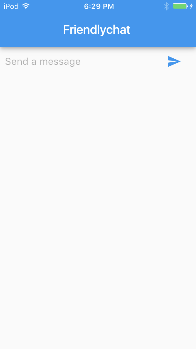
Hot reload the app. You should see a screen that looks like this.
iOS | Android |
|
|
Debug your app with IntelliJ
The IntelliJ IDE enables you to debug Flutter apps running on a simulator/emulator or on a device. With the IntelliJ editor, you can:
- Select a device or simulator to debug your app on.
- View the console messages.
- Set breakpoints in your code.
- Examine variables and evaluate expressions at run time.
The IntelliJ editor shows the system log while your app is running and provides a Debugger UI to work with breakpoints and control the execution flow.
Work with breakpoints
To debug your Flutter app using breakpoints:
- Open the source file in which you want to set a breakpoint.
- Locate the line where you want to set a breakpoint, click on it, then select Run > Toggle Line Breakpoint in the menu. Alternatively, you can click in the gutter (to the right of the line number) to toggle a breakpoint.
- If you weren't previously running in debug mode, stop the app.
- Restart the app using Run > Debug in the menu.
The IntelliJ editor launches the Debugger UI and pauses the execution of your app when it reaches the breakpoint. You can then use the controls in the Debugger UI to identify the cause of the error.
Practice using the debugger by setting breakpoints on the build() methods in your Friendlychat app, then run and debug the app. You can inspect the stack frames to see the history of method calls by your app.
With the basic app scaffolding and screen in place, now you're ready to define the area where chat messages will be displayed.
Implement a message list
In this section, you'll create a widget that displays users' chat messages. You'll do this using composition, by creating and combining multiple smaller widgets. Start with a widget that represents a single chat message, nest that widget in a parent scrollable list, and nest the scrollable list in the basic app scaffold.
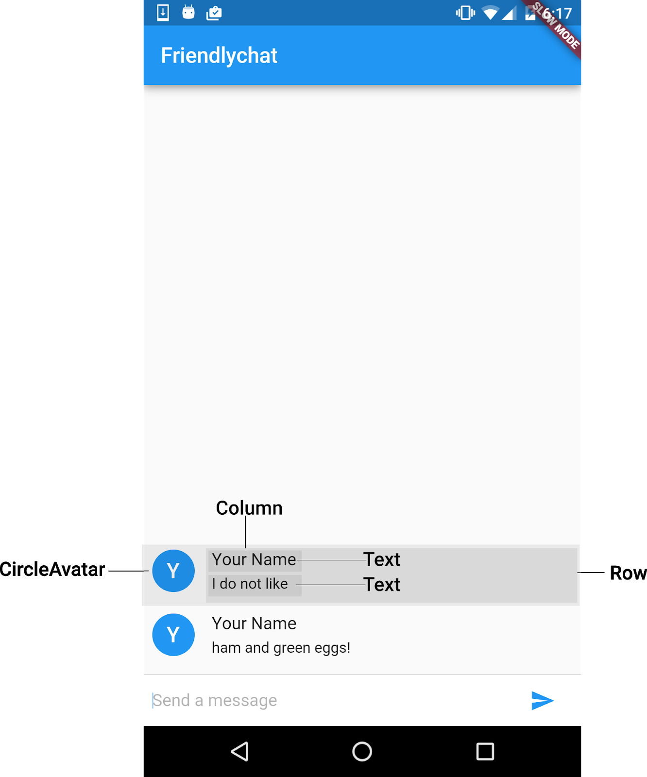
First, we need a widget that represents a single chat message. Define a StatelessWidget called ChatMessage as follows. Its build() method returns a Row widget that displays a simple graphical avatar to represent the user who sent the message, a Column widget containing the sender's name, and the text of the message.
main.dart
// Add the following class definition to main.dart.

class ChatMessage extends StatelessWidget {
  ChatMessage({this.text});
  final String text;
  @override
  Widget build(BuildContext context) {
    return new Container(
      margin: const EdgeInsets.symmetric(vertical: 10.0),
      child: new Row(
        crossAxisAlignment: CrossAxisAlignment.start,
        children: <Widget>[
          new Container(
            margin: const EdgeInsets.only(right: 16.0),
            child: new CircleAvatar(child: new Text(_name[0])),
          ),
          new Column(
            crossAxisAlignment: CrossAxisAlignment.start,
            children: <Widget>[
              new Text(_name, style: Theme.of(context).textTheme.subhead),
              new Container(
                margin: const EdgeInsets.only(top: 5.0),
                child: new Text(text),
              ),
            ],
          ),
        ],
      ),
    );
  }
}
Define the _name variable as shown, replacing Your Name with your own name. We'll use this variable to label each chat message with the sender's name. In this codelab, you hard-code the value for simplicity but most apps will retrieve the sender's name via authentication, as shown in the Firebase for Flutter codelab.
main.dart
// Add the following code to main.dart.

const String _name = "Your Name";
To personalize the CircleAvatar widget, label it with the user's first initial by passing the first character of the _name variable's value to a child Text widget. We'll use CrossAxisAlignment.start as the crossAxisAlignment argument of the Row constructor to position the avatar and messages relative to their parent widgets.
For the avatar, the parent is a Row widget whose main axis is horizontal, so CrossAxisAlignment.start gives it the highest position along the vertical axis. For messages, the parent is a Column widget whose main axis is vertical, so CrossAxisAlignment.start aligns the text at the furthest left position along the horizontal axis.
Next to the avatar, align two Text widgets vertically to display the sender's name on top and the text of the message below. To style the sender's name and make it larger than the message text, you'll need to use Theme.of(context)to obtain an appropriate ThemeData object. Its textTheme property gives you access to Material Design logical styles for text like subhead, so you can avoid hard-coding font sizes and other text attributes.
We haven't specified a theme for this app, so Theme.of(context)retrieves the default Flutter theme. In a later step, you'll override this default theme to style your app differently for Android vs. iOS.
Implement a chat message list
The next refinement is to get the list of chat messages and show it in the UI. We want this list to be scrollable so that users can view the chat history. The list should also present the messages in chronological order, with the most recent message displayed at the bottom-most row of the visible list.
In your ChatScreenState widget definition, add a List member called _messages to represent each chat message. Each list item is a ChatMessage instance. You need to initialize the message list to an empty List.
main.dart
// Add the following code to the ChatScreenState class definition.

class ChatScreenState extends State<ChatScreen> {
  final List<ChatMessage> _messages = <ChatMessage>[];             // new
  final TextEditingController _textController = new TextEditingController();
When the current user sends a message from the text field, your app should add the new message to the message list. Modify your _handleSubmitted() method as follows to implement this behavior.
main.dart
// Modify the code in the _handleSubmitted method definition.

void _handleSubmitted(String text) {
  _textController.clear();
    ChatMessage message = new ChatMessage(                         //new
      text: text,                                                  //new
    );                                                             //new
    setState(() {                                                  //new
      _messages.insert(0, message);                                //new
    });                                                            //new
 }
You call setState()to modify _messages and to let the framework know this part of the widget tree has changed and it needs to rebuild the UI. Only synchronous operations should be performed in setState(), because otherwise the framework could rebuild the widgets before the operation finishes.
In general, it is possible to call setState() with an empty closure after some private data changed outside of this method call. However, updating data inside setState()'s closure is preferred, so you don't forget to call it afterwards.
Place the message list
You're now ready to display the list of chat messages. We'll get the ChatMessage widgets from the _messages list and put them in a ListView widget, for a scrollable list.
In the build() method of your ChatScreenState class, add a ListView widget for the message list. We choose the ListView.builder constructor because the default constructor doesn't automatically detect mutations of its children argument.
main.dart
// Modify the code in the ChatScreenState class definition as follows.

Widget build(BuildContext context) {
  return new Scaffold(
    appBar: new AppBar(title: new Text("Friendlychat")),
    body: new Column(                                        //modified
      children: <Widget>[                                         //new
        new Flexible(                                             //new
          child: new ListView.builder(                            //new
            padding: new EdgeInsets.all(8.0),                     //new
            reverse: true,                                        //new
            itemBuilder: (_, int index) => _messages[index],      //new
            itemCount: _messages.length,                          //new
          ),                                                      //new
        ),                                                        //new
        new Divider(height: 1.0),                                 //new
        new Container(                                            //new
          decoration: new BoxDecoration(
            color: Theme.of(context).cardColor),                  //new
          child: _buildTextComposer(),                       //modified
        ),                                                        //new
      ],                                                          //new
    ),                                                            //new
  );
}
The body property of the Scaffold widget now contains the list of incoming messages as well as the input field and send button. We are using the following layout widgets:
Column, which lays out its direct children vertically.Columncan take multiple child widgets, which will be a scrolling list and a row for an input field.Flexible, as a parent ofListView. This tells the framework to let the list of received messages expand to fill theColumnheight whileTextFieldremains a fixed size.Divider, to draw a horizontal rule between the UI for displaying messages and the text input field for composing messages.Container, as a parent of the text composer, which is useful for defining background images, padding, margins, and other common layout details. Usedecorationto create a newBoxDecorationobject that defines the background color. In this case we're using thecardColordefined by theThemeDataobject of the default theme. This gives the UI for composing messages a different background from the messages list.
Pass arguments to the ListView.builder constructor to customize the list contents and appearance:
paddingfor white space around the message textreverseto make theListViewstart from the bottom of the screenitemCountto specify the number of messages in the listitemBuilderfor a function that builds each widget in[index]. Since we don't need the current build context, we can ignore the first argument ofIndexedWidgetBuilder. Naming the argument_(underscore) is a convention to indicate that it won't be used.
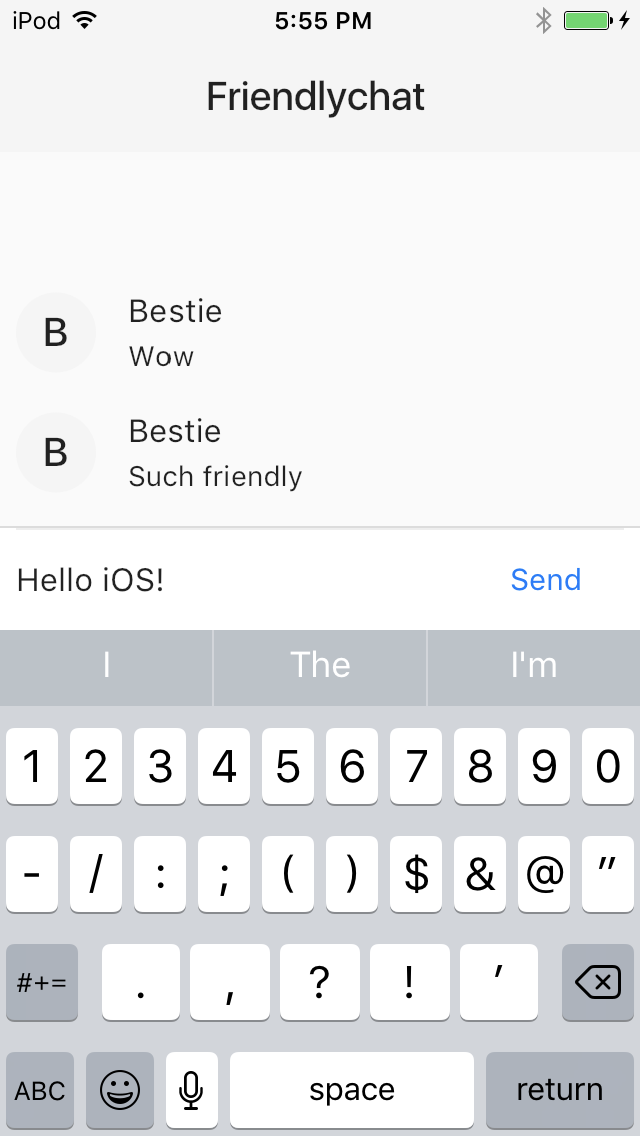
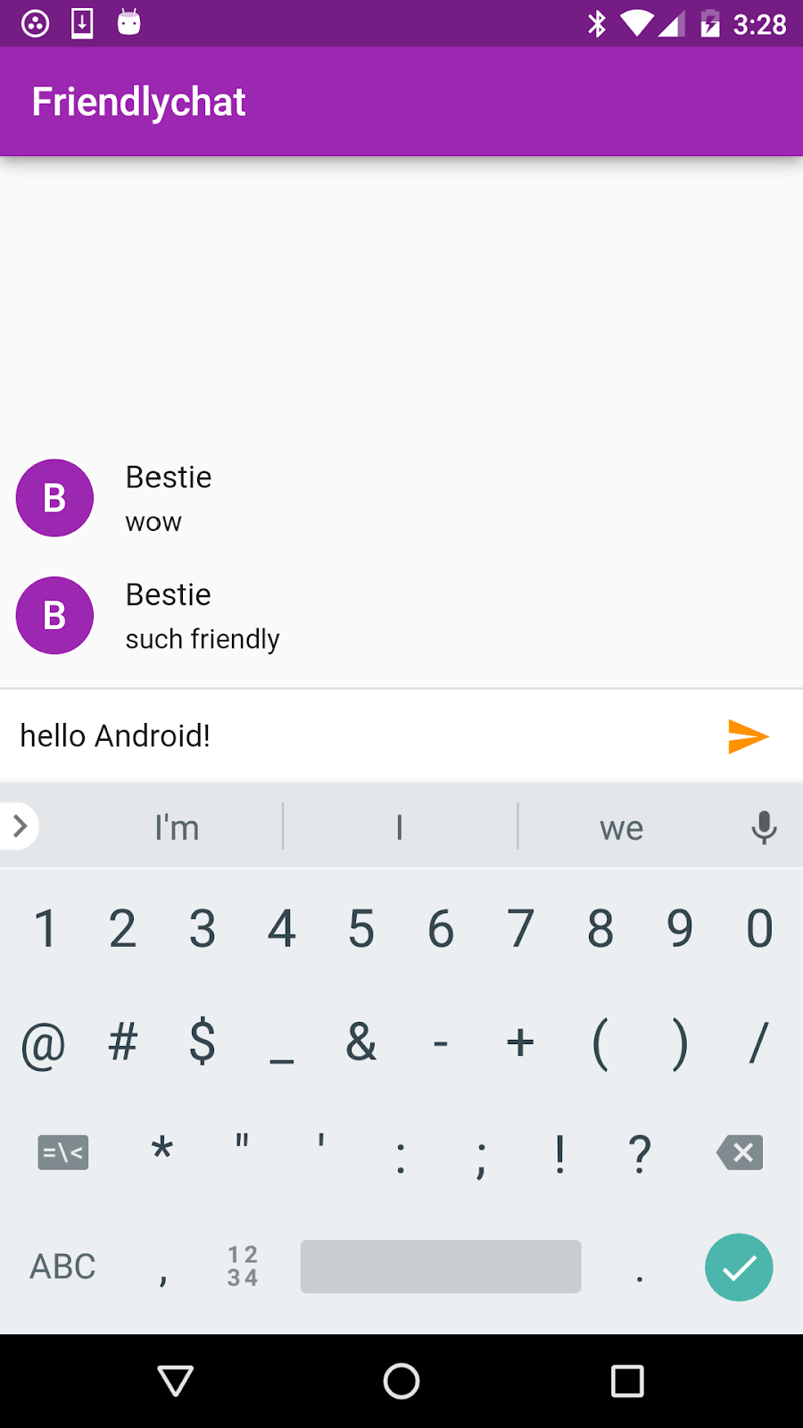
Hot reload the app. You should see a single screen that looks as follows:
iOS | Android |
|
|
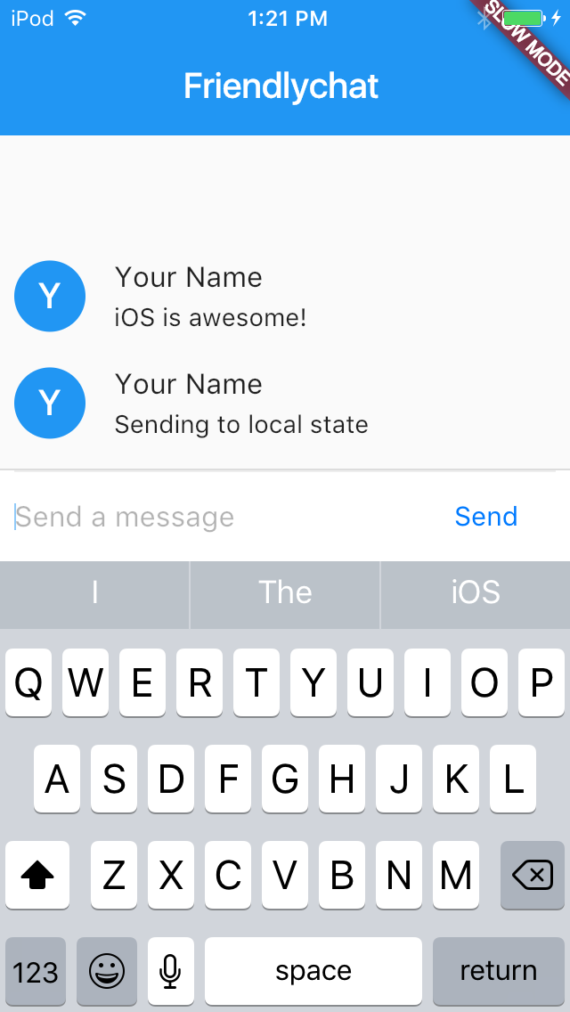
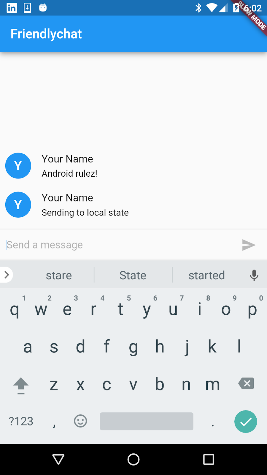
Now, try sending a few messages using the UIs for composing and displaying that you just built!
iOS | Android |
|
|
You can add animation effects to your widgets to make the user experience of your app more fluid and intuitive. In this section, we'll go over how to add a basic animation effect to your chat message list.
When the user sends a new message, instead of simply displaying it in the message list, we'll animate the message to ease out vertically from the bottom of the list.
Animations in Flutter are encapsulated as Animation objects that contain a typed value and a status (such as forward, backward, completed, and dismissed). You can attach an animation object to a widget or listen for changes to the animation object. Based on changes to the animation object's properties, the framework can modify the way your widget appears and rebuild the widget tree.
Specify an animation controller
Use the AnimationController class to specify how the animation should run. The AnimationController class lets you define important characteristics of the animation, such as its duration and playback direction (forward or reverse).
When creating an AnimationController, you must pass it a vsync argument. The vsync prevents animations that are offscreen from consuming unnecessary resources. To use your ChatScreenState as the vsync, include a TickerProviderStateMixin mixin in the ChatScreenState class definition.
main.dart
// Modify the code in the ChatScreenState class definition as follows.

class ChatScreenState extends State<ChatScreen> with TickerProviderStateMixin { // modified
  final List<ChatMessage> _messages = <ChatMessage>[];
  final TextEditingController _textController = new TextEditingController();
In the ChatMessage class definition, add a member variable to store the animation controller.
main.dart
// Modify the ChatMessage class definition as follows.

class ChatMessage extends StatelessWidget {
  ChatMessage({this.text, this.animationController});         //modified
  final String text;
  final AnimationController animationController;                   //new
Modify the _handleSubmitted() method in your ChatScreenState class as follows. In this method, instantiate an AnimationController object and specify the animation's runtime duration to be 700 milliseconds. (We picked this longer duration period to slow down the animation effect so you can see the transition happen more gradually; in practice, you'll probably want to set a shorter duration period and disable slow mode when running your app.)
Attach the animation controller to a new ChatMessage instance, and specify that the animation should play forward whenever a new message is added to the chat list
main.dart
// Modify the _handleSubmittted method definition as follows.

void _handleSubmitted(String text) {
  _textController.clear();
  ChatMessage message = new ChatMessage(
    text: text,
    animationController: new AnimationController(                  //new
      duration: new Duration(milliseconds: 700),                   //new
      vsync: this,                                                 //new
    ),                                                             //new
  );                                                               //new
  setState(() {
    _messages.insert(0, message);
  });
  message.animationController.forward();                           //new
}
Add a SizeTransition widget
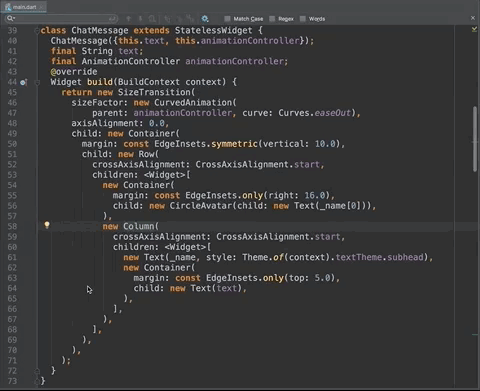
Modify the ChatMessage object's build() method to return a SizeTransition widget that wraps the Container child widget we previously defined. The SizeTransition class provides an animation effect where the width or height of its child is multiplied by a given size factor value.
The CurvedAnimation object, in conjunction with the SizeTransition class, produces an ease-out animation effect. The ease-out effect causes the message to slide in quickly at the beginning of the animation and slow down until it comes to a stop.
main.dart
// Modify the build() method for the ChatMessage class as follows.

class ChatMessage extends StatelessWidget {
  ChatMessage({this.text, this.animationController});
  final String text;
  final AnimationController animationController;
  @override
  Widget build(BuildContext context) {
    return new SizeTransition(                                    //new
    sizeFactor: new CurvedAnimation(                              //new
        parent: animationController, curve: Curves.easeOut),      //new
    axisAlignment: 0.0,                                           //new
    child: new Container(                                    //modified
      margin: const EdgeInsets.symmetric(vertical: 10.0),
      child: new Row(
          crossAxisAlignment: CrossAxisAlignment.start,
          children: <Widget>[
            new Container(
              margin: const EdgeInsets.only(right: 16.0),
              child: new CircleAvatar(child: new Text(_name[0])),
            ),
            new Column(
              crossAxisAlignment: CrossAxisAlignment.start,
              children: <Widget>[
                new Text(_name, style: Theme.of(context).textTheme.subhead),
                new Container(
                  margin: const EdgeInsets.only(top: 5.0),
                  child: new Text(text),
                ),
              ],
            ),
          ],
        ),
      )                                                           //new
    );
  }
}
Dispose the animation
It's good practice to dispose of your animation controllers to free up your resources when they are no longer needed. The following code snippet shows how you can implement this operation by overriding the dispose() method in ChatScreenState. In the current app, the framework does not call the dispose()method since the app only has a single screen. In a more complex app with multiple screens, the framework would invoke the method when the ChatScreenState object was no longer in use.
main.dart
// Add the following code to the ChatScreenState class definition.

@override
void dispose() {                                                   //new
  for (ChatMessage message in _messages)                           //new
    message.animationController.dispose();                         //new
  super.dispose();                                                 //new
}                                                                  //new
To see the animation effect, restart your app and enter a few messages. Using restart rather than hot reload clears any existing messages that do not have an animation controller.
If you want to experiment further with animations, here are a few ideas to try:
- Speed up or slow down the animation effect by modifying the
durationvalue specified in the_handleSubmitted()method. - Specify different animation curves by using the constants defined in the
Curvesclass. - Create a fade-in animation effect by wrapping the
Containerin aFadeTransitionwidget instead of aSizeTransition.
In this optional step, you'll give your app a few sophisticated details, like making the Send button enabled only when there's text to send, wrapping longer messages, and adding native-looking customizations for iOS and Android.
Make the Send button context-aware
Currently, the Send button appears enabled even when there is no text in the input field. You might want the button's appearance to change depending on whether the field contains text to send.
Define _isComposing, a private member variable that is true whenever the user is typing in the input field.
main.dart
// Add the following code in the ChatScreenState class definition.

class ChatScreenState extends State<ChatScreen> with TickerProviderStateMixin {
  final List<ChatMessage> _messages = <ChatMessage>[];
  final TextEditingController _textController = new TextEditingController();
  bool _isComposing = false;                                      //new
To be notified about changes to the text as the user interacts with the field, pass an onChanged callback to the TextField constructor. TextField calls this method whenever its value changes with the current value of the field. In your onChanged callback, call setState() to change the value of _isComposing to true when the field contains some text.
Then modify the onPressed argument to be null when _isComposing is false.
main.dart
// Modify the _buildTextComposer method with the code below
// to add the onChanged() and onPressed() callbacks.

Widget _buildTextComposer() {
  return new IconTheme(
    data: new IconThemeData(color: Theme.of(context).accentColor),
    child: new Container(
      margin: const EdgeInsets.symmetric(horizontal: 8.0),
      child: new Row(
        children: <Widget>[
          new Flexible(
            child: new TextField(
              controller: _textController,
              onChanged: (String text) {          //new
                setState(() {                     //new
                  _isComposing = text.length > 0; //new
                });                               //new
              },                                  //new
              onSubmitted: _handleSubmitted,
              decoration:
                  new InputDecoration.collapsed(hintText: "Send a message"),
            ),
          ),
          new Container(
            margin: new EdgeInsets.symmetric(horizontal: 4.0),
            child: new IconButton(
              icon: new Icon(Icons.send),
              onPressed: _isComposing
                  ? () => _handleSubmitted(_textController.text)    //modified
                  : null,                                           //modified
            ),
          ),
        ],
      ),
    ),
  );
}
Modify _handleSubmitted to update _isComposing to false when the text field is cleared.
main.dart
// Modify the _handleSubmittted method definition as follows.

void _handleSubmitted(String text) {
  _textController.clear();
  setState(() {                                                    //new
    _isComposing = false;                                          //new
  });                                                              //new
  ChatMessage message = new ChatMessage(
    text: text,
    animationController: new AnimationController(
      duration: new Duration(milliseconds: 700),
      vsync: this,
    ),
  );
  setState(() {
    _messages.insert(0, message);
  });
  message.animationController.forward();
}
The _isComposing variable now controls the behavior and the visual appearance of the Send button.
- If the user types a string in the text field,
_isComposingistrueand the button's color is set toTheme.of(context).accentColor. When the user presses the button, the system invokes_handleSubmitted(). - If the user types nothing in the text field,
_isComposingisfalseand the widget'sonPressedproperty is set tonull, disabling the send button. The framework will automatically change the button's color toTheme.of(context).disabledColor.
Wrap longer lines
When a user sends a text that exceeds the width of the UI for displaying messages, the lines should wrap so the entire message displays. Right now, lines that overflow are truncated and a error message is displayed. A simple way of making sure the text wraps correctly is to add an Expanded widget.
In this step, you'll wrap the Column widget where messages are displayed in an Expanded widget. Expanded allows a widget like Column to impose layout constraints (in this case the Column's width), on a child widget. Here it constrains the width of the Text widget, which is normally determined by its contents.
This part of the widget hierarchy is defined by the build() method of the ChatMessage class. We'll try out a couple of handy IntelliJ shortcuts to add a parent widget:
- Place the cursor in the
new Columnexpression. - Click the lightbulb icon in the left margin and select Wrap with new widget from the popup menu. IntelliJ adds a generic
new widgetexpression, correctly formatted, for you to customize. This quick way of adding expressions and nesting widgets is even faster when you use the keyboard shortcut, option+return (macOS) or alt+enter (Linux, Windows). - With the cursor over the highlighted
widgetkeyword placeholder, press the key combination for smart code completion. If you need to look it up, see the IntelliJ IDEA reference. - Select Expanded from the list of possible objects that can be a parent of Column. It should be the first item on the list.
The following code snippet shows how the ChatMessage class looks after making this change:
main.dart
//Modify the ChatMessage class definition in main.dart.

...

new Expanded(                                               //new
  child: new Column(                                   //modified
    crossAxisAlignment: CrossAxisAlignment.start,
    children: <Widget>[
      new Text(_name, style: Theme.of(context).textTheme.subhead),
      new Container(
        margin: const EdgeInsets.only(top: 5.0),
        child: new Text(text),
      ),
    ],
  ),
),                                                          //new

...
Customize for iOS and Android
To give your app's UI a natural look and feel, you can add a theme and some simple logic to the build() method for the FriendlychatApp class. In this step, you define a platform theme that applies a different set of primary and accent colors. You also customize the Send button to use a CupertinoButton on iOS and a Material Design IconButton on Android.
iOS | Android |
|
|
First, define a new ThemeData object named kIOSTheme with colors for iOS (light grey with orange accents) and another ThemeData object kDefaultTheme with colors for Android (purple with orange accents).
main.dart
// Add the following code to main.dart.

final ThemeData kIOSTheme = new ThemeData(
  primarySwatch: Colors.orange,
  primaryColor: Colors.grey[100],
  primaryColorBrightness: Brightness.light,
);

final ThemeData kDefaultTheme = new ThemeData(
  primarySwatch: Colors.purple,
  accentColor: Colors.orangeAccent[400],
);
Modify the FriendlychatApp class to vary the theme using the theme property of your app's MaterialApp widget. Use the top-level defaultTargetPlatform property and conditional operators to build an expression for selecting a theme.
main.dart
// Add the following code to main.dart.

import 'package:flutter/foundation.dart';                        //new

// Modify the FriendlychatApp class definition in main.dart.

class FriendlychatApp extends StatelessWidget {
  @override
  Widget build(BuildContext context) {
    return new MaterialApp(
      title: "Friendlychat",
      theme: defaultTargetPlatform == TargetPlatform.iOS         //new
        ? kIOSTheme                                              //new
        : kDefaultTheme,                                         //new
      home: new ChatScreen(),
    );
  }
}
We can apply the selected theme to the AppBar widget (the banner at the top of your app's UI). The elevation property defines the z-coordinates of the AppBar. A z-coordinate value of 0.0 has no shadow (iOS) and a value of 4.0 has a defined shadow (Android).
main.dart
// Modify the build() method of the ChatScreenState class.

Widget build(BuildContext context) {
  return new Scaffold(
    appBar: new AppBar(
      title: new Text("Friendlychat"),                                 //modified
      elevation:
         Theme.of(context).platform == TargetPlatform.iOS ? 0.0 : 4.0, //new
   ),
Customize the Send icon by modifying its Container parent widget in the _buildTextComposer method. Use the child property and conditional operators to build an expression for selecting a button.
main.dart
// Add the following code to main.dart.

import 'package:flutter/cupertino.dart';                      //new

// Modify the _buildTextComposer method.

new Container(
   margin: new EdgeInsets.symmetric(horizontal: 4.0),
   child: Theme.of(context).platform == TargetPlatform.iOS ?  //modified
   new CupertinoButton(                                       //new
     child: new Text("Send"),                                 //new
     onPressed: _isComposing                                  //new
         ? () =>  _handleSubmitted(_textController.text)      //new
         : null,) :                                           //new
   new IconButton(                                            //modified
       icon: new Icon(Icons.send),
       onPressed: _isComposing ?
           () =>  _handleSubmitted(_textController.text) : null,
       )
   ),
Wrap the top-level Column in a Container widget to give it a light grey border on its upper edge. This border will help visually distinguish the app bar from the body of the app on iOS. To hide the border on Android, apply the same logic used for the app bar in the previous snippet.
main.dart
// Modify the following lines in main.dart.

Widget build(BuildContext context) {
  return new Scaffold(
    appBar: new AppBar(
        title: new Text("Friendlychat"),
        elevation:
            Theme.of(context).platform == TargetPlatform.iOS ? 0.0 : 4.0),
    body: new Container(                                             //modified
        child: new Column(                                           //modified
          children: <Widget>[
            new Flexible(
              child: new ListView.builder(
                padding: new EdgeInsets.all(8.0),
                reverse: true,
                itemBuilder: (_, int index) => _messages[index],
                itemCount: _messages.length,
              ),
            ),
            new Divider(height: 1.0),
            new Container(
              decoration: new BoxDecoration(color: Theme.of(context).cardColor),
              child: _buildTextComposer(),
            ),
          ],
        ),
        decoration: Theme.of(context).platform == TargetPlatform.iOS //new
            ? new BoxDecoration(                                     //new
                border: new Border(                                  //new
                  top: new BorderSide(color: Colors.grey[200]),      //new
                ),                                                   //new
              )                                                      //new
            : null),                                                 //modified
  );
}
Hot reload the app. You should see different colors, shadows, and icon buttons for iOS and Android.
Congratulations!
You now know the basics of building cross-platform mobile apps with the Flutter framework.
What we've covered
- How to build a Flutter app from the ground up in the IntelliJ editor.
- How to run, hot reload, and debug your Flutter app on a simulator/emulator and on a device.
- How to customize your user interface with widgets and animations.
- How to customize your user interface for iOS and Android.
What's next
Try one of the other Flutter codelabs.
Continue learning about Flutter:
- flutter.io: The documentation site of the Flutter project.
- Build Native Mobile Apps with Flutter (a free Udacity course)
- The Flutter API reference documentation.
- Additional Flutter sample apps, with source code.
Optional: Get the sample code
We recommend downloading the sample if you want to view the samples as reference or start the codelab at a specific section. To get a copy of the sample code for the codelab, run this command from your terminal:
git clone https://github.com/flutter/friendlychat-steps.git
The sample code is in the offline_steps folder. We have created snapshots for you for each step, one snapshot per directory. Each step builds on the preceding step.